In proclaiming the faith and in administering the sacraments every priest speaks on behalf of Jesus Christ, for Jesus Christ.
Real Investment Advice

Behavioral Traits That Are Killing Your Portfolio Returns
Investor psychology is one of the most significant reasons individuals consistently fall short of their investment goals. While one of the most common truisms is that “investors buy high and sell low,” the underlying reason is the behavioral traits that plague our investment decision-making.
George Dvorsky once wrote that:
“The human brain is capable of 1016 processes per second, which makes it far more powerful than any computer currently in existence. But that doesn’t mean our brains don’t have major limitations. The lowly calculator can do math thousands of times better than we can, and our memories are often less than useless — plus, we’re subject to cognitive biases, those annoying glitches in our thinking that cause us to make questionable decisions and reach erroneous conclusions.“
Behavioral traits and cognitive biases are anathemas to portfolio management as they impair our ability to remain emotionally disconnected from our money. As history all too clearly shows, investors always do the “opposite” of what they should when it comes to investing their own money. They “buy high” as the emotion of “greed” overtakes logic and “sell low” as “fear” impairs the decision-making process.
In other words:
“The most dangerous element to our success as investors…is ourselves.”
Here are the top five most insidious behavioral traits keeping us from achieving our long-term investment goals.

Confirmation Bias
Probably one of the most insidious behavioral traits is “confirmation bias.” Confirmation bias is a term from cognitive psychology that describes how people naturally favor information that confirms their previously existing beliefs.
“Experts in behavioral finance find that this fundamental principle applies to investors in notable ways. Because investors seek out information that confirms their opinions and ignore facts or data that refutes them, they may skew the value of their decisions based on their cognitive biases. This psychological phenomenon occurs when investors filter out potentially useful facts and opinions contradicting their preconceived notions.” – Investopedia
In other words, investors tend to seek information that confirms their beliefs. If they believe the stock market will rise, they tend only to read news and information that supports that view. This confirmation bias is a primary driver of individuals’ psychological investing cycles. As shown below, there are always “headlines” from the media to “confirm” an investor’s opinion, whether it’s bullish or bearish.
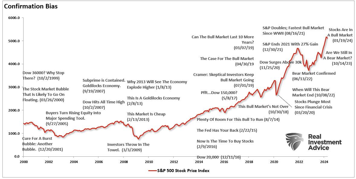
As investors, we want “affirmation” that our current thought process is correct. That is why we tend to join groups on social media that confirm our thoughts and ideals. Therefore, since we hate being wrong, we subconsciously avoid contradicting sources of information.
For investors, it is crucial to weigh both sides of each debate equally and analyze the data accordingly.
Being right and making money are not mutually exclusive.

Gambler’s Fallacy
The “Gambler’s Fallacy” is another of the more common behavioral traits. As emotionally driven human beings, we tend to put tremendous weight on previous events, believing that future outcomes will be the same.
At the bottom of every piece of financial literature, Wall Street addresses that behavioral trait.
“Past performance is no guarantee of future results.”
However, despite that statement being plastered everywhere in the financial universe, individuals consistently dismiss the warning and focus on past returns, expecting similar results in the future.
This particular behavioral trait is a critical issue affecting investors’ long-term returns. Performance chasing has a high propensity to fail, pushing individuals to jump from one late-cycle strategy to the next. The periodic table of returns below shows this. Historically, “hot hands” last 2-3 years before going “cold.”
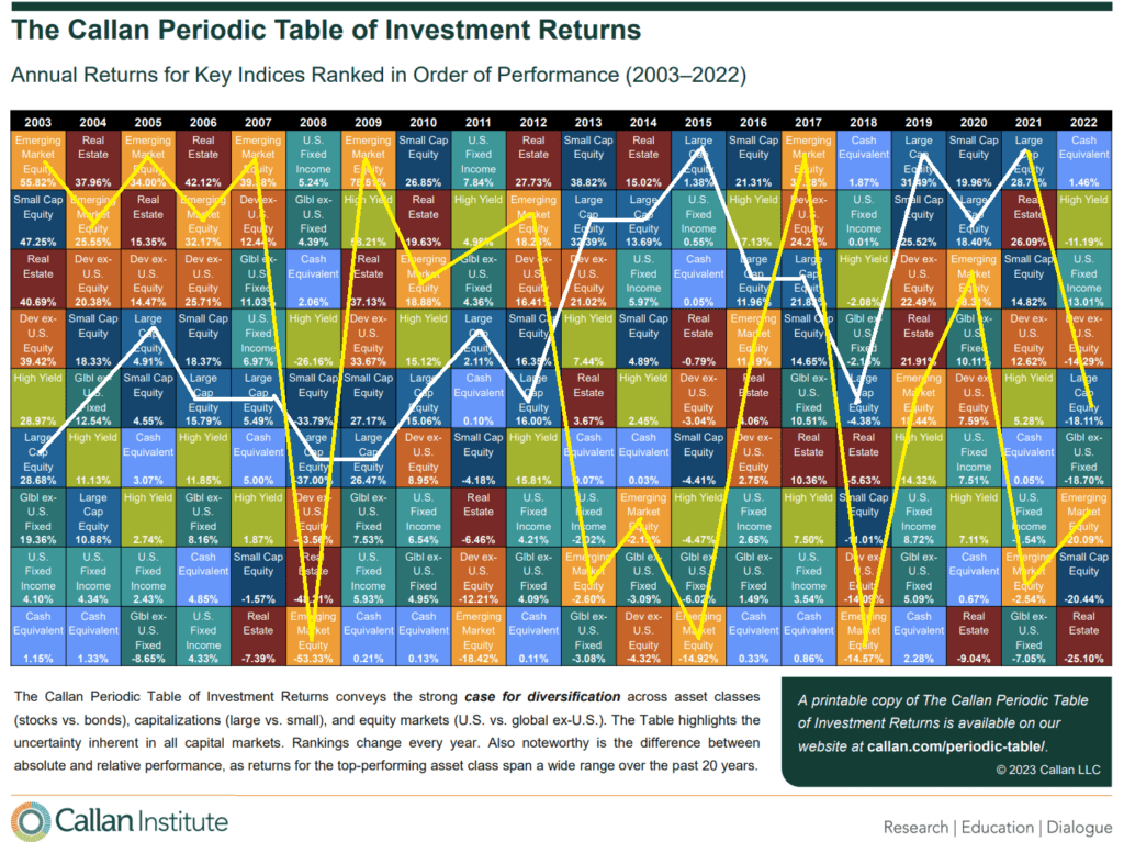
I highlighted the annual returns of both Emerging and Large-Cap markets for illustrative purposes. Importantly, you should notice that whatever is at the top of the list in some years tends to fall to the bottom in subsequent years.
“Performance chasing” is a significant detraction from investors’ long-term investment returns.
Probability Neglect
Third, when it comes to “risk-taking,” there are two ways to assess the potential outcome.
There are “possibilities” and “probabilities.”
When it comes to humans, we tend to lean toward what is possible, such as playing the “lottery.” The statistical probabilities of winning the lottery are astronomical. You are more likely to die on the way to purchasing the ticket than winning it. However, it is the “possibility” of being fabulously wealthy that makes the lottery so successful as a “tax on poor people.”
As investors, we neglect the “probabilities” of any given action. Such is specifically the statistical measure of “risk” undertaken with any given investment. As individuals, our behavioral trait is to “chase” stocks that have already shown the largest increase in price as it is “possible” they could move even higher. However, the “probability” is that the price reflects investor exuberance, and most gains have already occurred.
Probability neglect is another contributory factor as to why investors consistently “buy high and sell low.”
Herd Bias
Though we are often unconscious of this particular behavioral trait, humans tend to “go with the crowd.” Much of this behavior relates to “confirmation” of our decisions and the need for acceptance. The thought process is rooted in the belief that if “everyone else” is doing something, I must do it also if I want to be accepted.
In life, “conforming” to the norm is socially accepted and, in many ways, expected. However, the “herding” behavior drives market excesses during advances and declines in the financial markets.
As Howard Marks once stated:
“Resisting – and thereby achieving success as a contrarian – isn’t easy. Things combine to make it difficult; including natural herd tendencies and the pain imposed by being out of step, since momentum invariably makes pro-cyclical actions look correct for a while. (That’s why it’s essential to remember that ‘being too far ahead of your time is indistinguishable from being wrong.’
Given the uncertain nature of the future, and thus the difficulty of being confident your position is the right one – especially as price moves against you – it’s challenging to be a lonely contrarian.”
Investors generate the most profits in the long term by moving against the “herd.” Unfortunately, most individuals have difficulty knowing when to “bet” against the stampede.

Anchoring Effect
Lastly, “Anchoring,” also known as the “relativity trap,” is the tendency to compare our current situation within the scope of our limited experiences. For example, I would be willing to bet that you could tell me exactly what you paid for your first home and what you eventually sold it for. However, can you tell me exactly what you paid for your first soap bar, hamburger, or pair of shoes? Probably not.
The reason is that the home purchase was a major “life” event. Therefore, we attach particular significance to that event and remember it vividly. If there was a gain between the purchase and sale price of the home, it was a positive event, and therefore, we assume that the next home purchase will have a similar result. We are mentally “anchored” to that event and base our future decisions around very limited data.
When it comes to investing, we do very much the same thing. If we buy a stock that goes up, we remember that event. Therefore, we become anchored to that stock instead of one that lost value. Individuals tend to “shun” stocks that lost value even if they were bought and sold at the wrong times due to investor error.
After all, it is not “our” fault that the investment lost money; it was just a bad stock. Right?
Make Better Bad Choices
My nutrition coach had a great saying about dieting; “make better bad choices.”
We are all going to make bad choices from time to time. The goal is to try and make bad choices that don’t have an outsized effect on our plan. When it comes to dieting, if you eat a burger, order it without cheese and mayonnaise.
If you make speculative bets in your portfolio, do it in smaller amounts. Or, if you are leaning towards “panic selling” everything, start by selling some but not all of your holdings.
Importantly, focus on the rules and your investment discipline.
- Do more of what is working and less of what isn’t.
- Remember that the “Trend Is My Friend.”
- Be either bullish or bearish, but not “hoggish.” (Hogs get slaughtered)
- Remember, it is “Okay” to pay taxes.
- Maximize profits by staging buys, working orders, and getting the best price.
- Look to buy damaged opportunities, not damaged investments.
- Diversify to control risk.
- Control risk by always having pre-determined sell levels and stop-losses.
- Do your homework.
- Not allow panic to influence buy/sell decisions.
- Remember that “cash” is for winners.
- Expect, but do not fear, corrections.
- Expect to be wrong, and will correct errors quickly.
- Check “hope” at the door.
- Be flexible.
- Have the patience to allow your discipline and strategy to work.
- Turn off the television, put down the newspaper, and focus on your analysis.
Importantly, keep your market perspectives and behavioral traits in check. Our goal is to ensure that our decisions are influenced by reliable data and psychological emotions.
Most importantly, if you don’t have an investment strategy and discipline you are stringently following, that is an ideal place to begin.
The post Behavioral Traits That Are Killing Your Portfolio Returns appeared first on RIA.
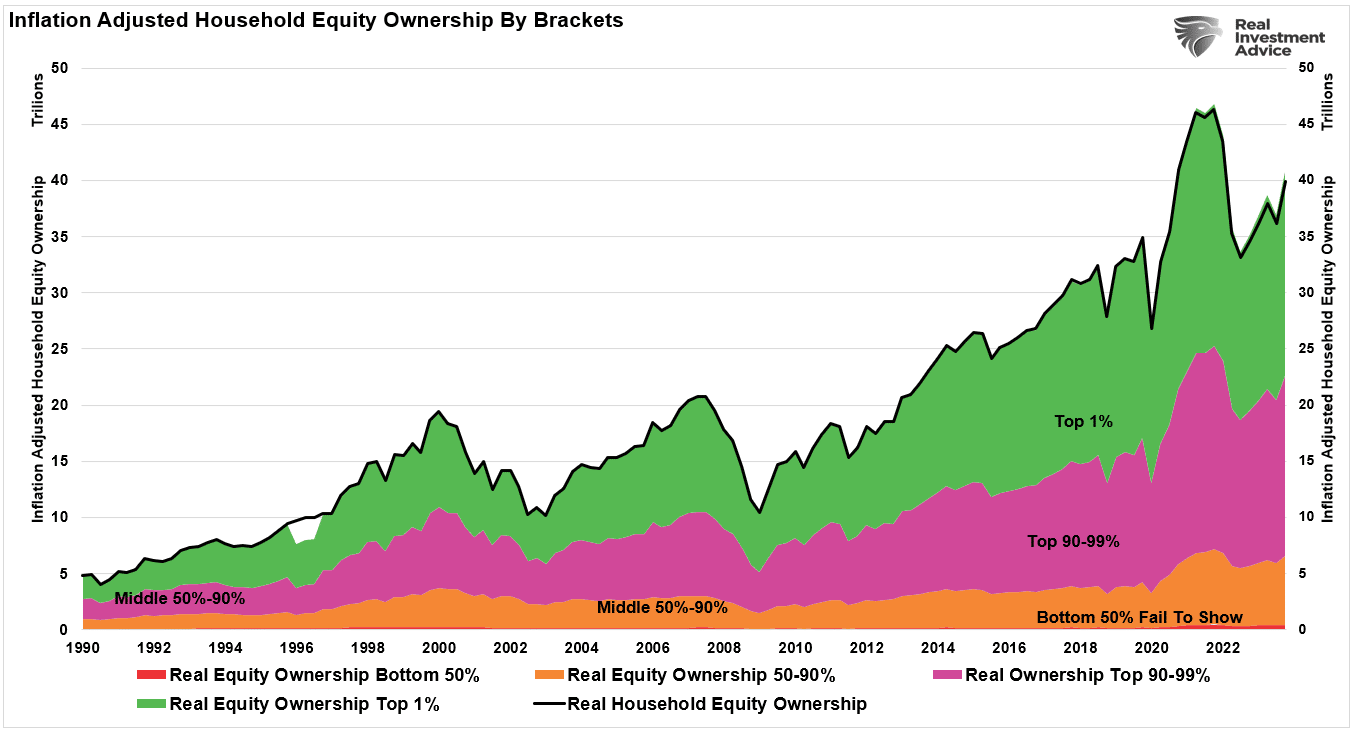
Fed Policies Turn The Wealth Gap Into A Chasm
In an op-ed for the Washington Post on November 5, 2010, Ben Bernanke did a victory lap, praising the Fed’s efforts in stemming the financial crisis. In the article, he discusses how QE and other Fed policies eased financial conditions, bolstering investor confidence.
And higher stock prices will boost consumer wealth and help increase confidence, which can also spur spending. Increased spending will lead to higher incomes and profits that, in a virtuous circle, will further support economic expansion.
If Bernanke wants credit for his Fed policies that boosted stock prices, he should also take responsibility for the costs. Those same monetary policies, which have been repeated many times since 2008, have played an important role in exacerbating the wealth gap in America. Accordingly, we should question his use of the term “virtuous circle” to describe how modern monetary policy works.
Graphing The Wealth Gap
Inspiration for this article comes from our recent article, Wealth Gap and the Road to Serfdom.
Before discussing the Fed’s role in widening the wealth gap, we put context to the problem. The graphs and quote below are from the article.


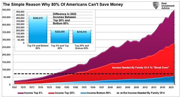
For 80% of Americans, the end game of too much debt, an aging demographic, and the push for “socialistic policies” is the continued extraction of wealth from the “middle class” to the “rich.”

Trickledown Economics and Monetary Policy
“Trickledown economics” was coined by John Kenneth Galbreth in 1982 and made famous by President Ronald Reagan. The expression is another name for supply-side economic policy. The policy theorizes that the populace benefits when government interference in the economy is minimal. For example, lower taxes and reduced regulations should promote economic activity and prosperity for the entire populace.
The theory is logical, but politicians have done a poor job enacting it.
In 2008, the Fed took a page from the supply-side economic playbook to stem the financial crisis. From that point forward, the Fed’s modus operandi has been trickle-down monetary policies.
Does QE Trickle Down?
Ben Bernanke wasn’t the first Fed Chair or central banker to use QE. But he did make it a household name and seemingly a permanent tool in the Fed’s toolbox.
QE has two significant impacts on the financial markets and the banking system.
First, removing assets from financial markets alters the supply-demand balance in favor of higher prices. Additionally, when investors believe QE is positive for asset prices, as is the case, demand increases, which provides even more impetus for higher asset prices.
Second, the Fed buys bonds from the banks with reserves. Reserves are a form of money that is only viable in transactions between banks or with the Fed. Reserves support bank loans and asset purchases. Therefore, when more reserves are available, banks can more easily make loans and buy assets. Further, some bank loans, specifically margin or repo loans, generate additional demand for assets.
The scatter plot below shows the positive correlation between the one-year percentage change in margin debt and the Fed’s balance sheet.
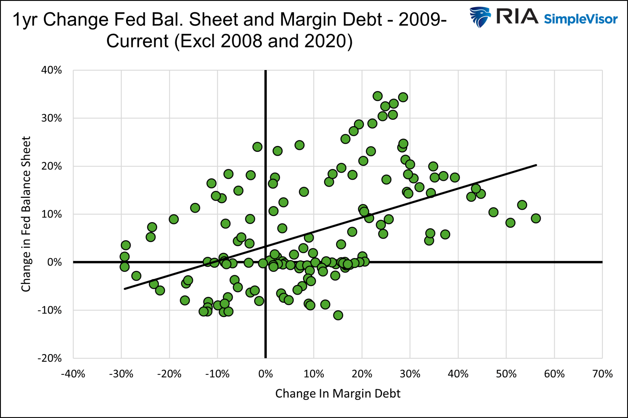
Higher stock and asset prices coupled with more leverage is a winning combination for investors.
The Graph of All Graphs
With that explanation of how trickledown monetary policy bolsters asset prices to accomplish the Fed’s goals, we share a graph explaining why the Fed’s policies widen the wealth gap.
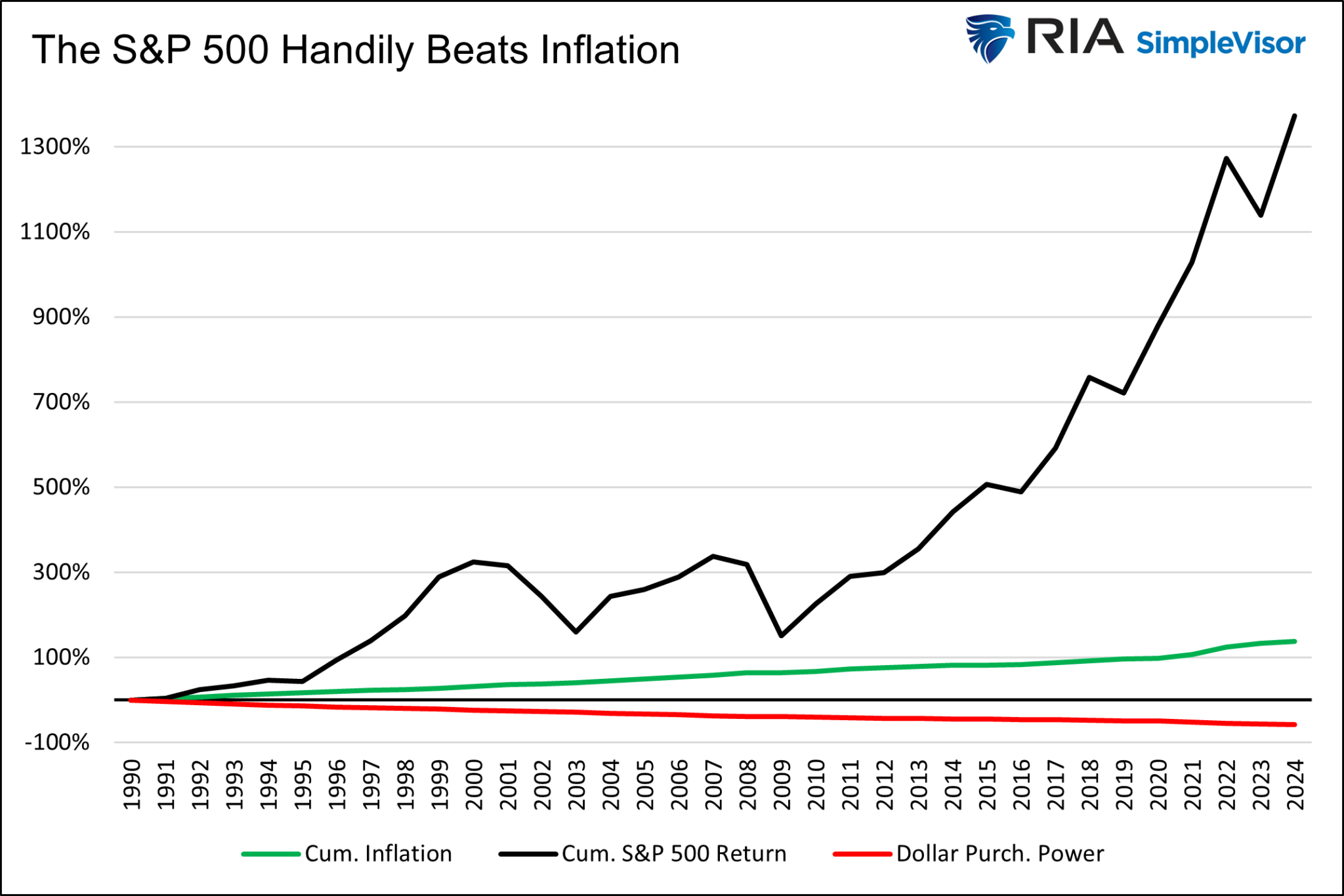
Since 1990, the dollar’s purchasing power has declined by over 50%. At the same time, the S&P 500 has risen by over 1,300%. Those with a sufficient portfolio of stocks could more than offset the decline in the dollar’s purchasing power. Those without stocks are left behind.
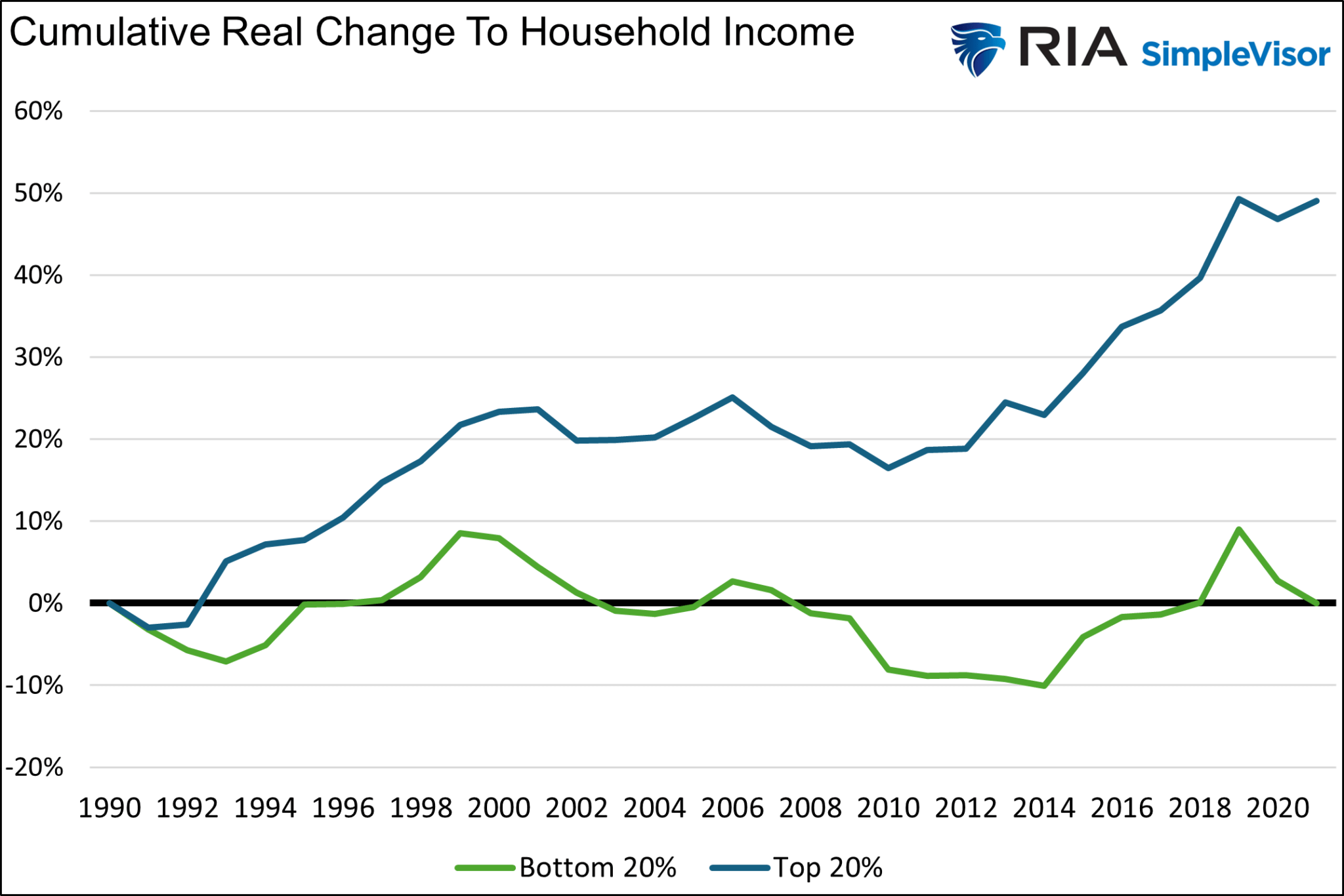
Further, it doesn’t help that real household income for the lowest 20% has been unchanged since 1990. Over the same period, they have risen by about 50% for those in the upper 20% of incomes.
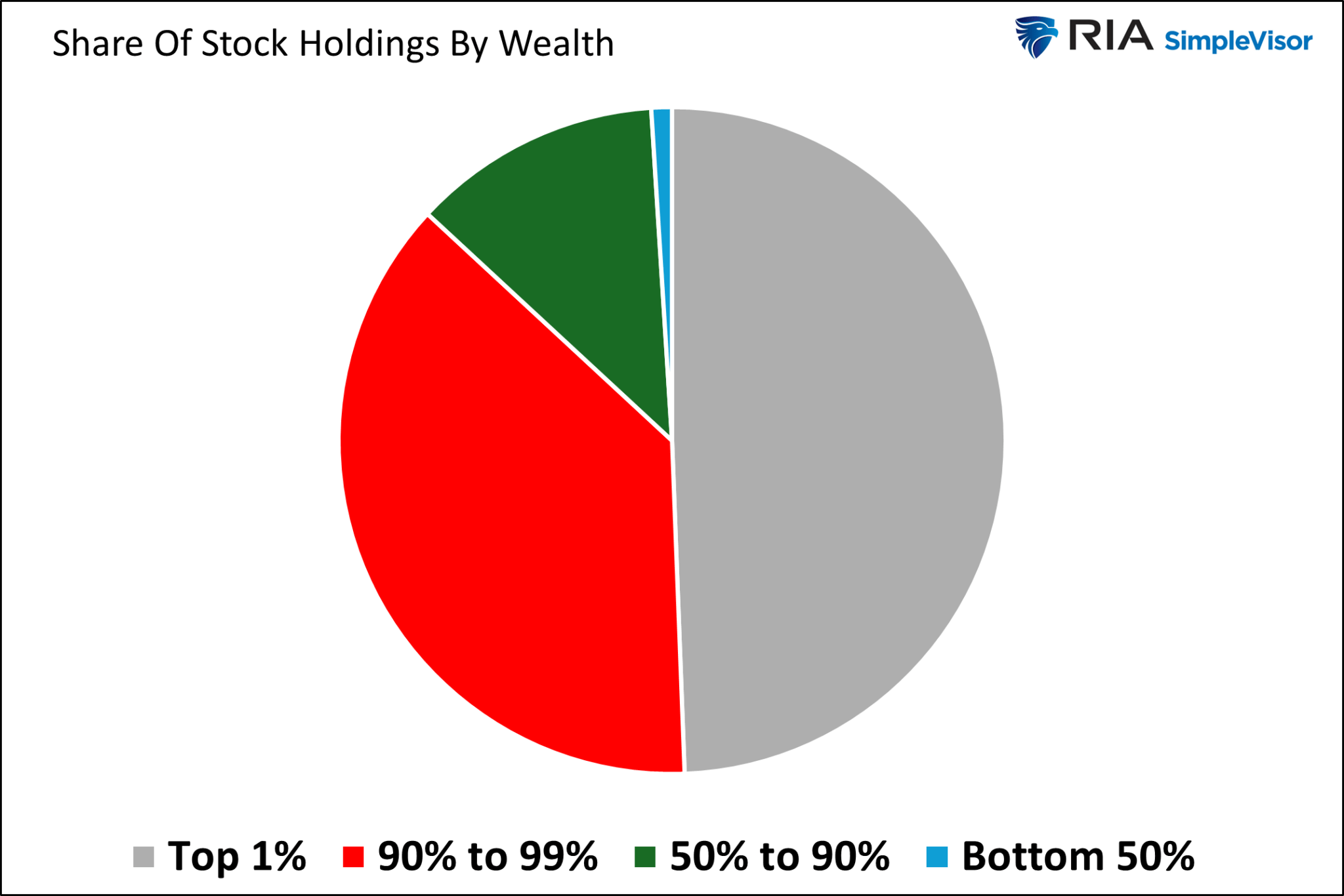
Share Of Wealth
The wealthier have seen their wages and the value of their financial assets rise much more than inflation. At the same time, the lower wealth and income classes have seen marginal real income gains at best and little in the way of benefits from rising stock prices.
The two graphs below show how the percentage of the wealth owned by the top 1% and the change in the S&P 500 are well correlated.
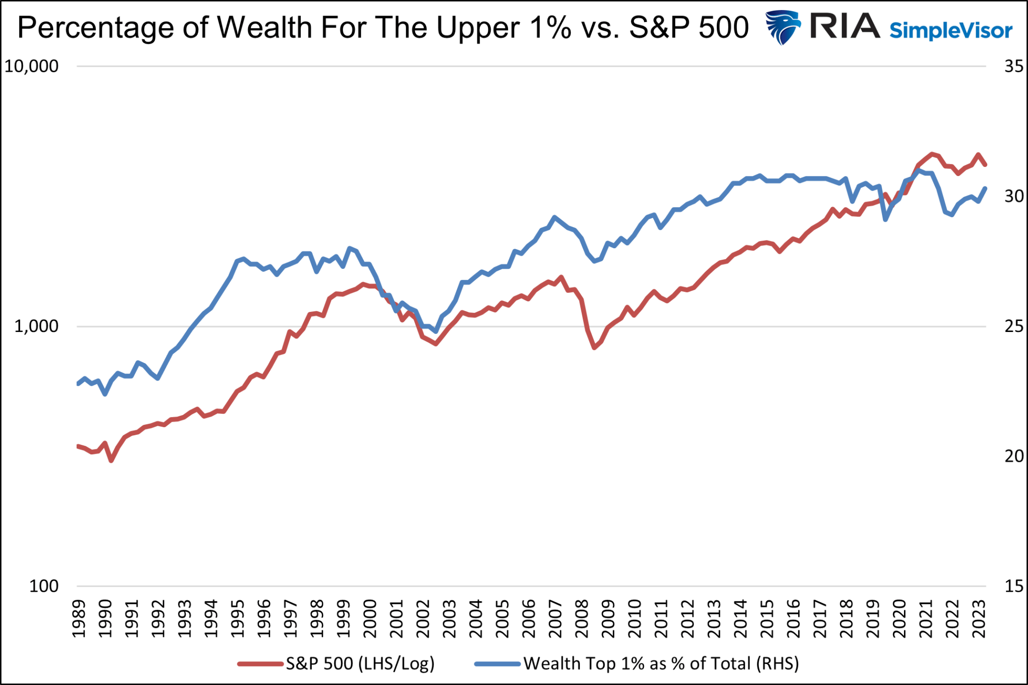
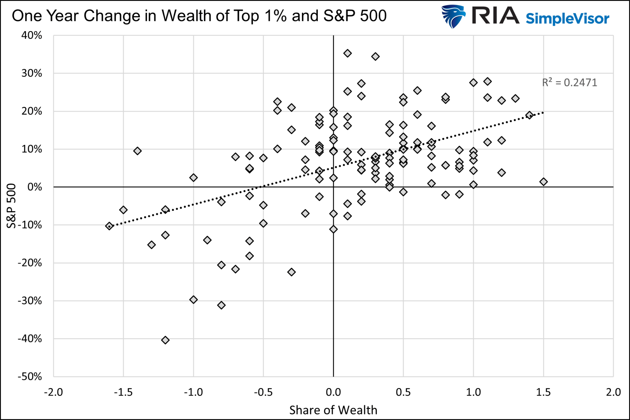
On the contrary, the aggregate wealth of much of the bottom half of the nation, as a percentage of total wealth, has a negative relationship with the S&P 500.
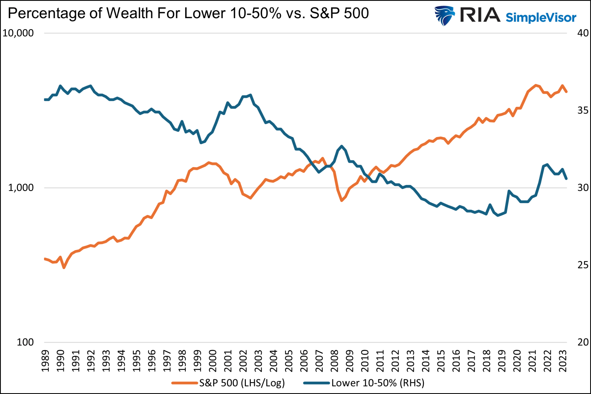

There is a straightforward explanation as to why the correlation between the share of the wealth of the rich versus that of the rest of the population has opposing correlations to the S&P 500. 10% of the population holds nearly 90% of the stocks.

Trickledown Monetary Policy Handicaps Capitalism
QE and other Fed policies may help the economy on the margin and save some jobs. However, there is little evidence that, over the longer term, the economic benefits increase the prosperity of most of the populace. Further, as we share, there is compelling evidence it further exacerbates the wealth gap.
Capitalism has proven to be the best economic system for growing the wealth of the entire population. A key tenant of capitalism promises financial incentives for those who work hard and have unique skill sets. That incentive results in productivity gains, which benefit economic growth and allow for higher wages and a broad distribution of wealth.
Unfortunately, when financial incentives are not only a function of capitalism but also an offshoot of government and Fed policies, the benefits of capitalism are reduced.
For example, Elon Musk is extraordinarily wealthy and should be rewarded handsomely for everything he has accomplished. However, how much of his wealth is based on his hard work and ingenuity, and how much was gifted to him by the Fed via their stock-boosting monetary policies. While slightly off-topic, we should also question how much of his wealth is attributable to government subsidies for electric vehicles.
Summary
President Biden’s poll numbers on economic confidence are poor despite robust economic growth and a historically low unemployment rate. While there are many reasons for the odd divergence, we think it’s fair to say that the benefits of the post-pandemic growth spurt have disproportionately accrued to those in higher-income classes and those with stocks. Those left behind, representing a large majority of the population, are not confident in Biden’s handling of the economy and suffer from higher prices.
Most Americans continue to see wages that cannot combat inflation and have little to no wealth invested in the stock market. Can you blame them for lacking confidence?
QE may have served as an emergency way to add bank reserves to the system and boost confidence. However, its continued use, even during economic prosperity periods, only makes the wealth gap wider.
The post Fed Policies Turn The Wealth Gap Into A Chasm appeared first on RIA.
Bullish Sentiment Index Reverses With Buybacks Resuming
Over the last two weeks, the bullish sentiment index has reversed from extreme greed to fear. The composite net bullish sentiment index, comprised of professional and retail investors, fell from 38.15 to 9.9 in two weeks. The previous drop between July and October last year was similar and marked the bottom of the correction.
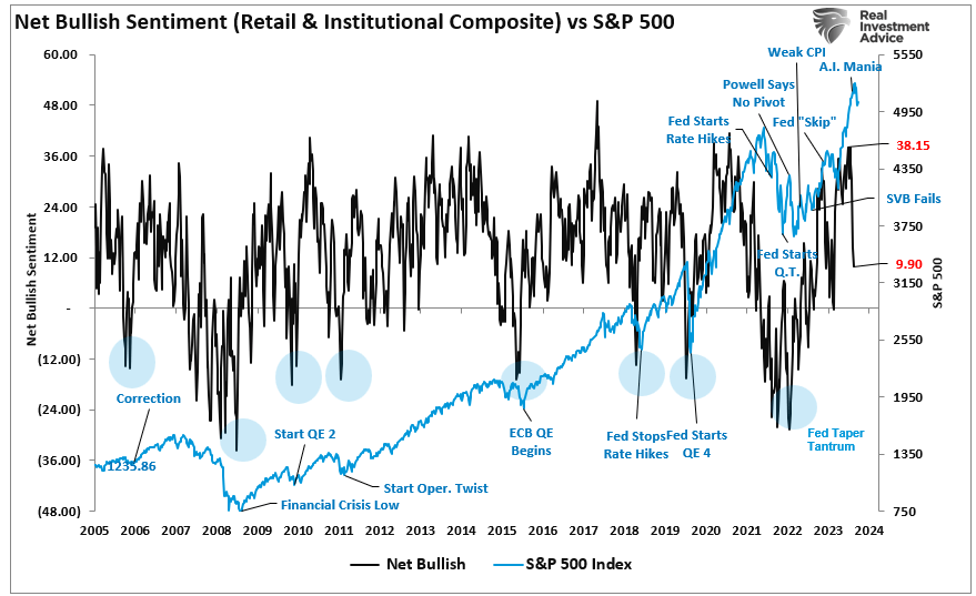
While the bullish sentiment index can indeed fall further, what is notable is the sharp reversal of market “exuberance” in such a short span. However, as discussed in “Just A Correction,” there was a significant gap between buyers and sellers.
“However, at some point, for whatever reason, this dynamic will change. Buyers will become more scarce as they refuse to pay a higher price. When sellers realize the change, they will rush to sell to a diminishing pool of buyers. Eventually, sellers will begin to “panic sell” as buyers evaporate and prices plunge.”
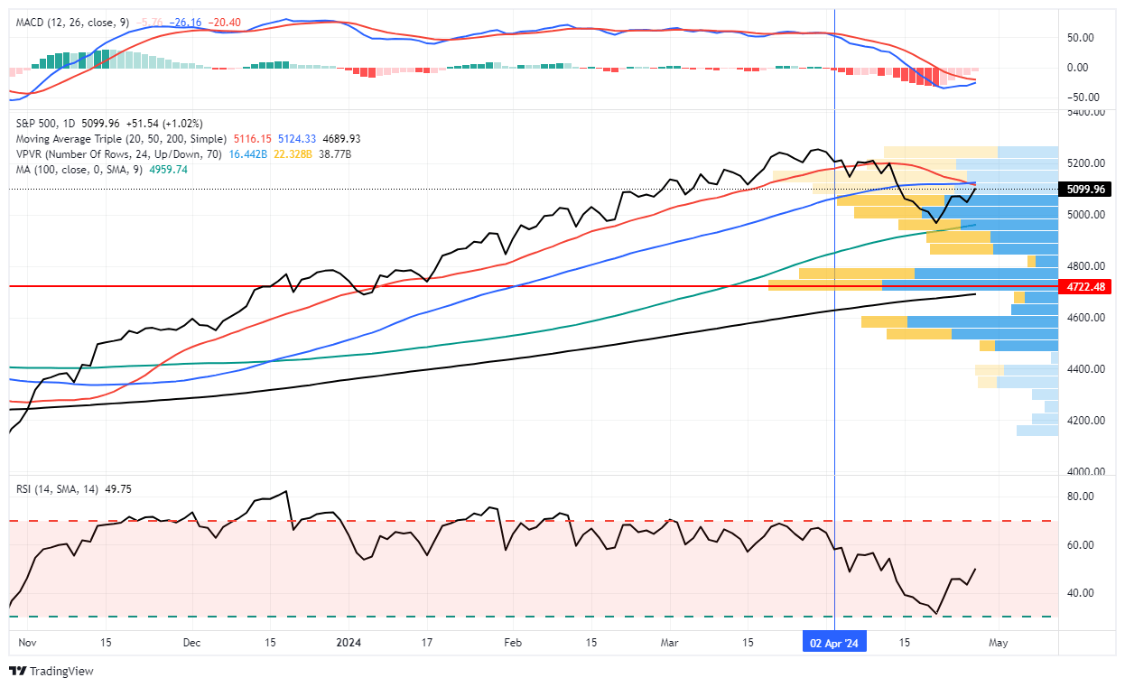
Like clockwork, that correction came quickly, with the market finding initial support at the 100-DMA. With solid earnings from GOOG and MSFT, the market rallied to initial resistance at the convergence of the 20- and 50-DMA. It would be unsurprising if the market failed this initial resistance test and ultimately retested the 100-DMA soon. Such a pullback would solidify that support and complete the reversal of the bullish sentiment index.
“Whatever trigger causes a reversal in the bullish signals, we will act accordingly to reduce risk and rebalance exposures. But one thing is sure: investor sentiment is extremely bullish, which has almost always been a good “bearish signal” to be more cautious.
While we have warned of a potential correction over the past few weeks, it reminds us much of June and July last year, where similar warnings for a 10% correction went unheeded. We are now seeing many individuals ‘jumping into the pool’ in some of the most speculative areas of the market. Such is usually a sign we are closer to a market peak than not. As such, we want to make adjustments before the correction comes.”
Very quickly, as supported by the bullish sentiment index, those bulls are turning bearish and are now calling for a more profound decline.
While such is possible, I suspect most of this correction is complete for two reasons.

Earnings Continue To Remain Strong
The first reason is that despite higher interest rates, earnings growth continues to remain robust, at least among the “Magnificent 7,” where Google (GOOG) and Microsoft (MSFT), in particular, exceeded estimates by a wide margin. However, overall, and most importantly, earnings growth has continued since the October lows of 2022. Notably, the support for improving earnings comes from the increased fiscal policies such as the Inflation Reduction Act and CHIPS Act.
While those policies will eventually fade, making forward estimates subject to downward revisions, the current earnings environment remains relatively robust. Furthermore, forward estimates remain optimistic that the Federal Reserve will cut rates later this year, lowering borrowing costs and supporting economic activity.
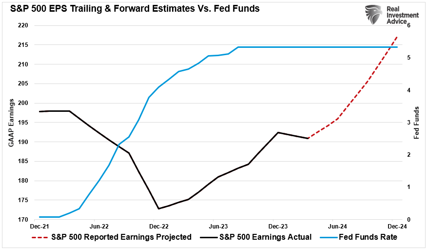
Notably, the increase in earnings, at least for now, remains a strong indicator of rising asset prices. The risk of a deeper market correction (greater than 10%) is significantly reduced during previous periods of improving earnings. While such does not mean a deeper correction can not happen, historically, corrections between 5% and 10% in an earnings growth environment tend to be buying opportunities and limit deeper reversal in the bullish sentiment index.
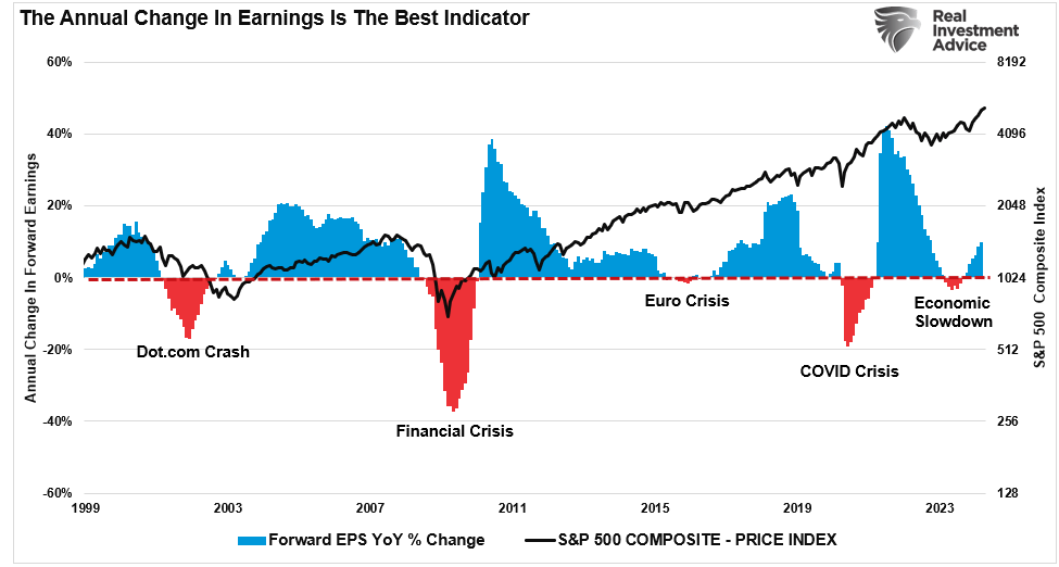
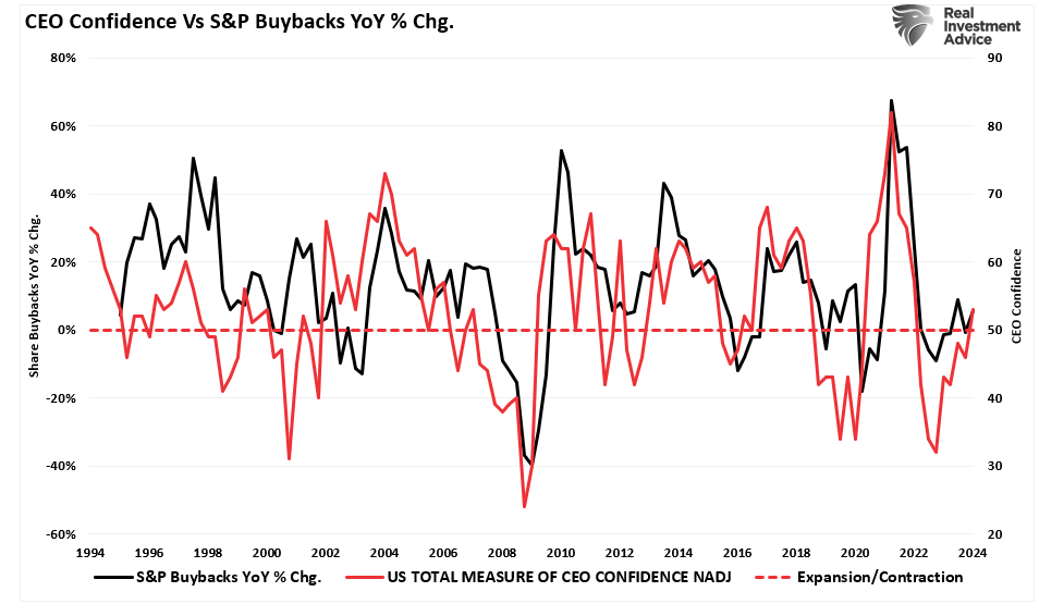
Improving earnings also precedes improving CEO confidence, which has provided pivotal support to financial markets since 2000.

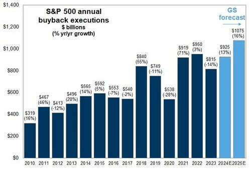
Buybacks Returning
We discussed the most critical reason we expected a market correction in mid-March. To wit:
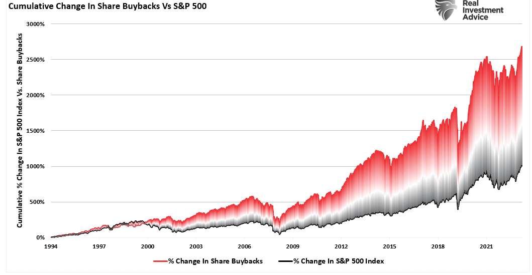
“Notably, since 2009, and accelerating starting in 2012, the percentage change in buybacks has far outstripped the increase in asset prices. As we will discuss, it is more than just a casual correlation, and the upcoming blackout window may be more critical to the rally than many think.” – March 19, 2024
Furthermore, the “blackout” of corporate buybacks coincided with more extreme readings in the bullish sentiment index. Buybacks are crucial to the market because corporations have accounted for roughly 100% of net equity purchases over the last two decades.
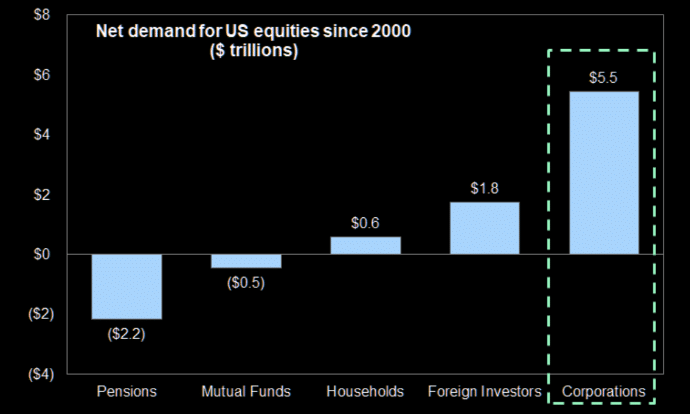
Here is the math of net flows if you don’t believe the chart:
- Pensions and Mutual Funds = (-$2.7 Trillion)
- Households and Foreign Investors = +$2.4 Trillion
- Sub Total = (-$0.3 T)
- Corporations (Buybacks) = $5.5T
- Net Total = $5.2 Trillion = Or 100% of all equities purchased
Unsurprisingly, that blackout window coincided with a sharp contraction of more than $367 billion in buybacks over the last 4-weeks. Consequently, when you remove a critical “buyer” from the market, the ensuing correction is unsurprising.
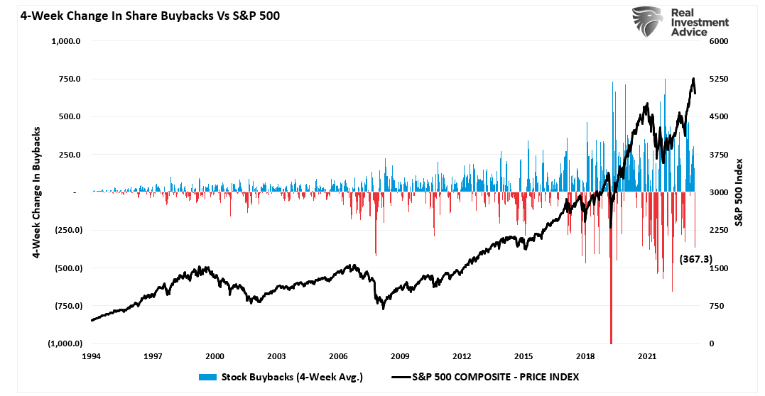
However, corporate share buybacks will resume in the next couple of weeks, and with more than $1 trillion slated for 2024, many buybacks remain to complete. Such is particularly the case with Google adding another $70 billion to that total.
As noted above, improving earnings and a decent outlook for the rest of this year also boost CEO confidence. (If you don’t understand why buybacks benefit insiders and not shareholders, read this.)
With robust economic activity supporting earnings growth, that improvement boosts CEO confidence. As CEOs are more confident about their business, they accelerate share buybacks to increase executive compensation.
The liquidity boost from buybacks and stronger earnings will likely provide a floor below the market. This doesn’t mean the current correction doesn’t have more work to do. However, it is unlikely that it will resolve into something more significant.
At least for now.
The post Bullish Sentiment Index Reverses With Buybacks Resuming appeared first on RIA.
Retail Sales Data Suggests A Strong Consumer Or Does It
The latest retail sales data suggests a robust consumer, leading economists to become even more optimistic about more robust economic growth this year. To wit:
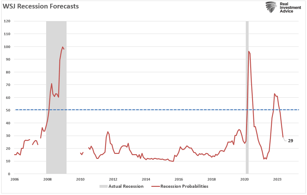
“It has been two years since forecasters felt this good about the economic outlook. In the latest quarterly survey by The Wall Street Journal, business and academic economists lowered the chances of a recession within the next year to 29% from 39% in the January survey. That was the lowest probability since April 2022, when the chances of a recession were set at 28%.
Economists don’t think the economy will get even close to a recession. In January, they, on average, forecast sub-1% growth in each of the first three quarters of this year. Now, they expect growth to bottom out this year at an inflation-adjusted 1.4% in the third quarter.” – WSJ
According to the March retail sales data, consumer spending added “fuel” to economists’ exuberance about this year.
Rising inflation in March didn’t deter consumers, who continued shopping at a more rapid pace than anticipated, the Commerce Department reported Monday. Retail sales increased 0.7% for the month, considerably faster than the Dow Jones consensus forecast for a 0.3% rise though below the upwardly revised 0.9% in February, according to Census Bureau data that is adjusted for seasonality but not for inflation.” – CNBC
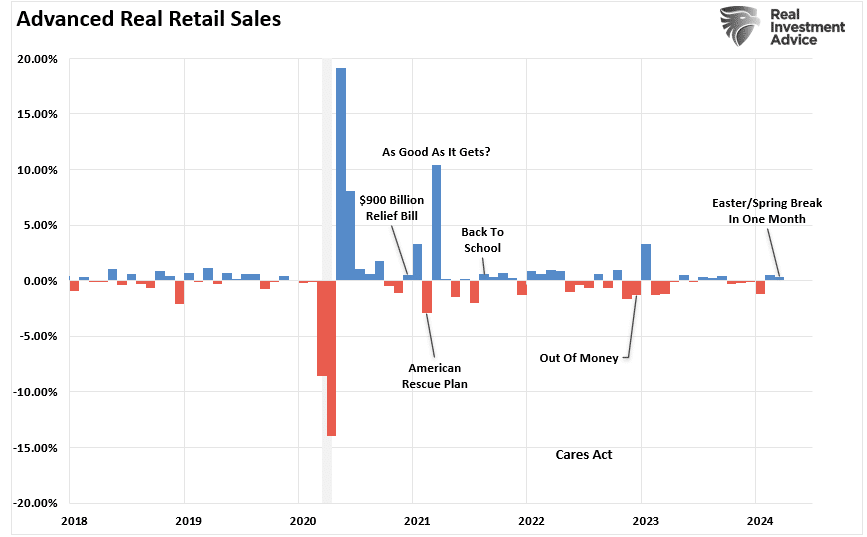
The chart below shows the monthly change in the retail sales data over the last two years.
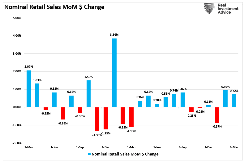
While mainstream economists trumpeted the strength of the consumer, the March retail sales data had some interesting points worth noting.
First, retail sales data was extraordinarily weak from October to January, the traditionally strongest shopping months of the year. That period included Halloween, Thanksgiving, Christmas, and NYear’sr’s. So, to some degree, the strength of spending over the last two months is unsurprising as, eventually, consumers need to buy goods or services previously postponed.
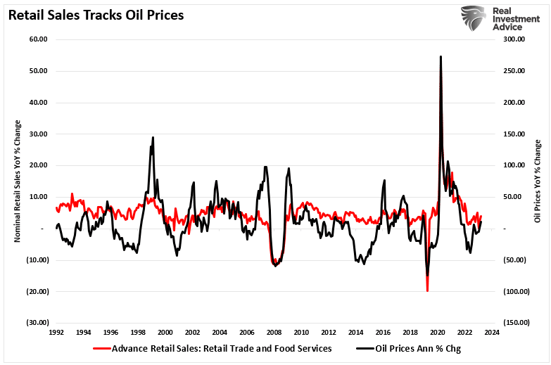
Secondly, while the March retail sales data was strong, it was weaker than February. However, March contained two significant spending periods, Spring Break and Easter, which generally don’t occur. Since Spring Break and Easter are considerable travel and shopping periods, it is unsurprising that the retail sales data increased with oil prices rising. As shown below, there is a very high correlation between nominal retail sales and oil prices.
Paying More For The Same Amount
Economists often overlook another important point about the retail sales data. As noted above, the March retail sales report was NOT adjusted for inflation. Furthermore, the report is in nominal “dollar volume” and not the amount of goods or services sold. Oil and gasoline prices are an excellent example of the issue with the retail sales data.
Let’s assume you own a car with 18-gallon fuel tank. Your daily activities are mostly going to work, going to the grocery store, eating out, having entertainment, etc. As such, you consume one tank of gas each week. Here is the math:
Week 1: 18-gallons of gas @ $3/gallon = $54.
That week, the store adds $54 to the monthly retail sales total for selling 18 gallons of gasoline. However, the price will increase to $4 per gallon next week.
Week 2: 18-gallons of gas @ $4/gallon = $72.
Here is the question.
While the retail sales data increased by $18 in week two, did the consumer purchase more gasoline? In other words, if the economy’s strength is ultimately measured by how much we produce (gross domestic product), then does spending more for the same amount of goods or services equate to a stronger economy?
The picture is quite different if we adjust the nominal retail sales data for inflation. Again, it is unsurprising that even on an inflation-adjusted basis, retail sales rose in February after declining for four months previously. However, with March containing Spring Break and Easter, the data suggests a weaker consumer that headlines tout.
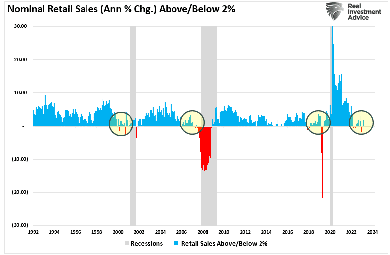
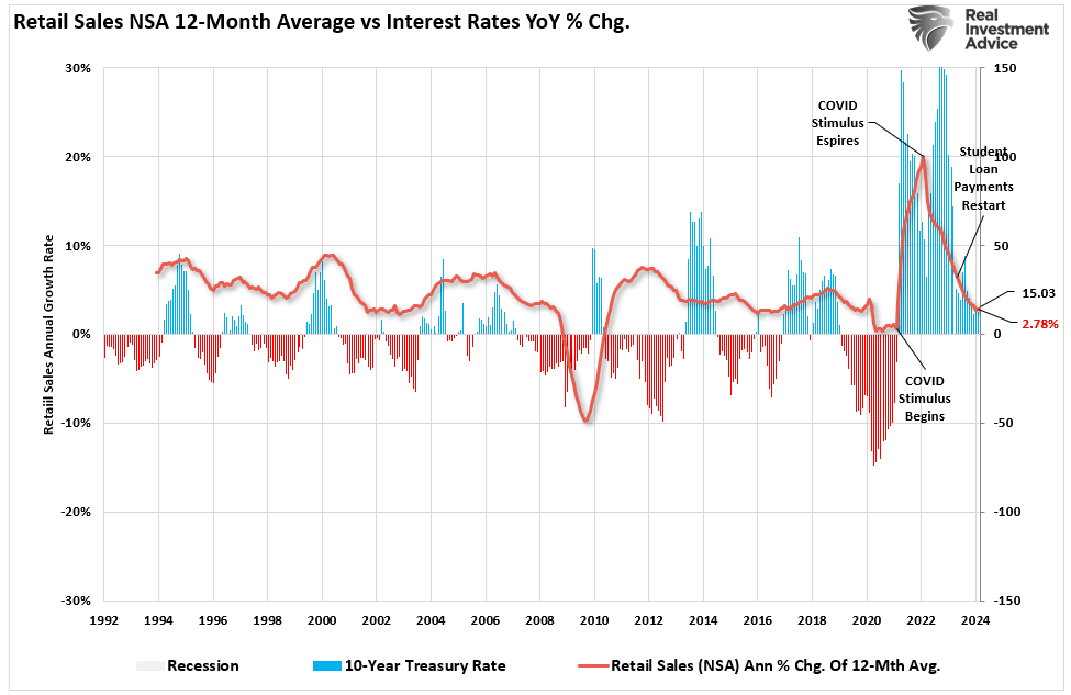
It is worth noting that retail sales data is not very useful in determining whether the economy is nearing a recession. As shown below, an annual growth rate of 2% has been a good marker for economic growth. As such, retail sales should grow at roughly 2% annually as well, given that personal consumption expenditures comprise approximately 70% of the economic equation. However, other than 2007, retail sales did not clarify economic strength.
In other words, spending more for the same amount of goods and services is not a sign of economic strength.

Economic Forecasts Tend To Be Erroneous
Furthermore, while the recent nominal sales data was robust, it is crucial to remember the economic data has a significant lag. Each of the dates below shows the economy’s growth rate immediately before the onset of a recession. You will note in the table that in 7 of the last 10 recessions, real GDP growth was running at 2% or above. In other words, according to the media, there was NO indication of a recession. But the next month, one began.
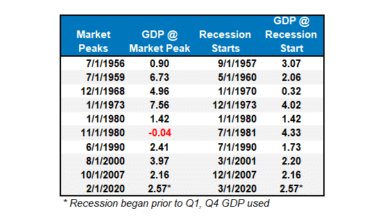
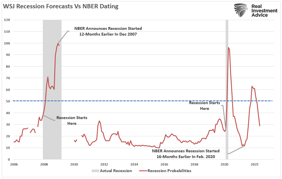
Crucially, I am not saying a recession is starting next month. However, I suggest that relying heavily on one month’s retail sales data to claim the economy avoided a recession is not likely ideal. Let’s revisit that chart of the WSJ economic forecast. I have added two notations: the start and end of recessions and when the NBER officially dated that period. As shown in both previous recessions, WSJ economists had a very low probability of the economy entering a recession just before it occurred.
The reality is that on an inflation-adjusted basis, the retail sales data suggests the consumer remains weak. While spending more to buy the same amount of goods or services may look good on paper, the average household has less money to spend elsewhere. As shown, the annual rate of change in real retail sales is near some of the lowest levels outside of a recession.
Lastly, consumer credit supporting retail sales will become more problematic with rising interest rates. Higher interest rates tend to reduce the average growth rate of retail sales data.
Our advice is to remain cautious about economic exuberance. Those forecasts are often disappointing.
The post Retail Sales Data Suggests A Strong Consumer Or Does It appeared first on RIA.
Overconfidence In NFL Drafts: A Lesson For Investors
Most NFL general managers (GMs) are optimistic and displaying overconfidence today as they prepare for tomorrow’s NFL draft. The draft is a once-a-year opportunity for GMs to acquire talent.
Like investors, GMs often think they are smarter than their competitors, aka the market. Yet, they frequently have similar mindsets and follow the same narratives that drive their competition.
As we will share, overconfidence and groupthink among football GMs and investors are behavioral flaws that often harm performance. Having the tools and strategies to mitigate our behavioral traits is extremely valuable and can lead you to better returns.
Overconfidence In The NFL
Four of the first five picks in the draft are expected to be quarterbacks. Not only is the quarterback the most important position on the field but this year’s draft is hyped as having several future greats.
Based on data from Warren Sharp, an NFL analyst, most of the quarterbacks taken in the early rounds will be average. His Fox Sports article entitled The success rate of first round QBs makes Lamar Jackson’s case for him, quantifies just how poor the odds are of drafting the next Super Bowl-winning quarterback.
There have been 38 quarterbacks drafted in the first round since 2011, the year the NFL changed the collective bargaining agreement.
These 38 first-round quarterbacks have made a total of 1,909 starts. Their record? 1034-1035-7.
He claims that of those 38 quarterbacks, only one, Patrick Mahomes, has won a Super Bowl. Furthermore, of the 28 from that group who are no longer on their initial contracts, the average time they were a starter was a mere 3.4 years.
Despite the proven mediocrity of quarterbacks taken in the first round, we have little doubt that overconfidence will be on full display by the GMs drafting quarterbacks with their top picks after they make their selections.
Groupthink In The NFL
This behavioral trait arises when people seeking conformity think and act similarly. Typically, groups reach a consensus opinion without proper evaluation and with minimal alternative viewpoints.
For instance, it is widely accepted that the four quarterbacks likely to go in the top five, Williams, Daniels, Maye, and McCarthy, will be excellent pros. Most NFL analysts offer differences between the quarterbacks but praise the physical and mental traits they believe will make them NFL starts. Very few analysts have poor ratings on any of those four quarterbacks.
Choosing one of the four quarterbacks is comforting. Simply, GMs have cover if their pick is a dud. Who could have known? Every expert thought he would be a superstar!
Investor Overconfidence And Groupthink
Replace players with investment ideas and GMs with investors. The overconfidence and groupthink mentality impacting GM draft day decisions are similar to those investors always face.
We quantified the odds of GMs picking above-average quarterbacks earlier. Per DFA Funds, the odds of an investor outperforming the market are even more daunting.
We saw from the data above that an investor has about a 75% chance of underperforming the market in any given year, which means you have a 25% chance of beating the market in any given year.
The message to take away from that statistic is to leave your confidence at the door!
Regarding groupthink, most investors, like GMs, find comfort in knowing that many other investors are doing the same thing. Market narratives are a form of groupthink. Narratives help explain market movements and trends. Often, a narrative develops after a trend has started. In other words, rightly or wrongly, the narrative is the rationale.
Today, narratives appear to be quicker to form and longer lasting. Maybe the advent of social media has allowed for their quicker dissemination and growth.
Narratives describe the mindset of a group of investors. When you unknowingly invest based on a narrative, you are likely setting yourself up for failure.
Strategies To Combat Behavioral Traits
Appreciating that GMs have a one in three chance of successfully using a precious top-five draft pick on a quarterback or that only a quarter of investors will beat the market, we best have tools to manage our behavioral traits and improve our odds of success.
Zig
Warren Sharp advises GMs to “zig while others zag.”
To zig is to have a contrarian mindset. For instance, it’s important for your portfolio to have popular stocks leading the market higher. But at the same time, understand that confidence can wane quickly, and a new set of stocks will take the throne soon enough. Don’t overstay your welcome in a narrative.
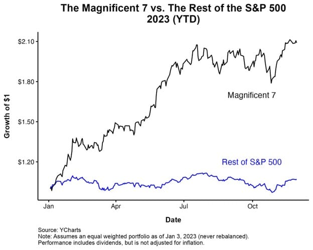
It wasn’t that long ago that the Magnificent Seven stocks were all the rage. Their returns handily beat almost every stock and index. Holding a meaningful subset of the seven stocks was vital to keep up with the broad market indexes. However, the Magnificent Seven’s period of outperformance has either ended or is on pause. But, the narrative still thrives, and whether it’s already happening or will occur shortly, investing in the aged groupthink will catch many investors offside.
Take Profits
It’s hard to sell when others are buying. Still, when the narrative-driven stocks fall out of favor, the prior profits and reduced position sizes will bolster returns and lessen the risk of underperforming the market.
Appreciating what the market, and not popular narratives, tell you is equally vital. For instance, have you noticed that utilities and energy are the best-performing sectors lately? Those solely holding the Magnificent Seven and neglecting other sectors are falling behind.
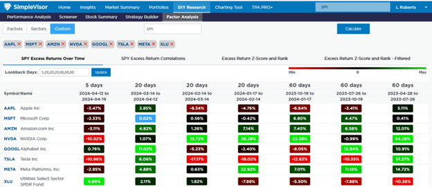
The SimpleVisor table below shows the relative performance of the Magnificent Seven stocks and XLU, the utility ETF, versus the S&P 500 over various time frames. Other than NVDA, most of the seven have been underperforming the market as of late. Also, the once poorly performing utility sector has been beating the market for the last 45 days. Selling the Magnificent Seven 45 days ago to buy utilities would go against groupthink, but it was a smart call.
Appreciate Your Options
The GMs with the top five picks have a precious option. Instead of picking a quarterback with limited odds of success, they can trade the pick to another team. In exchange, they might receive multiple high-level draft picks, boosting the odds of success.
Other positions in the NFL draft have much better success rates than quarterbacks. If a GM can set aside their confidence in their ability to pick the right quarterback, they can increase the odds that they could easily land at least two very good players and possibly a pro bowler. Maybe they can even use one of the picks to get a quarterback in the later rounds. Let’s not forget Brock Purdy, the San Francisco quarterback who led the 49ers to the Superbowl, was Mr. Irrelevant, the last person taken in the draft.
Investors have options, too. Many stocks, sectors, and factors will likely outperform the market but do not fit the narrative du jour. While buying what others aren’t may be uncomfortable, it may be more profitable.
The other lesson is to diversify. Putting most of your eggs in one basket can significantly impact your relative performance. You will underperform if you are proven wrong, as is most common.
Let Winners Run
One of the most popular Wall Street sayings is, “Cut your losses short and let your winners run.”
If our chances of beating the market are one in four, doesn’t it make sense to trade your portfolio actively? Many investors do the opposite. Their confidence and the attraction of groupthink keep them in underperforming stocks. At the same time, alternative stocks that are less followed may be the best bets.
It can be appropriate and profitable at times to follow the crowd. However, at all costs, don’t ignore alternative views.
Summary
We risk underperforming the market by falling victim to our natural behavioral traits. Therefore, we owe it to ourselves to entertain and understand alternative views. As odd as it may seem these days, we need to watch FOX News and read the New York Times. We must challenge ourselves to understand better things that may not be comfortable.
Seek out and study the views of others with whom you disagree. By better understanding opposing opinions, you will strengthen your existing views or better recognize flaws in your current logic. Either way, an investment thesis is better for it.
Most importantly, remember that you are only human. The Patrick Mahomes of the investment world are few and far between. At times, overconfidence is a good trait, but it can also be a critical flaw.
The post Overconfidence In NFL Drafts: A Lesson For Investors appeared first on RIA.
Just A Correction, Or Is The Bull Market Over?
Is this just a correction after a strong bullish advance from November, or is the bull market ending? If you read some of the headlines, you would suspect the latter. As noted by MarketWatch last week:
“For the first time since early November 2023, less than 30% of S&P 500 stocks are trading above their 50-day moving average — a clear indicator of the current poor market’s breadth. This significant drop from the 85% observed in late March and 92% at the beginning of January highlights a dramatic reversal in market dynamics.
The 50-day moving average is often seen as a barometer for the short-term health of stocks. Falling below this level en masse suggests that a broad swath of the market is facing downward pressure. This shift comes amid escalating geopolitical tensions in the Middle East and renewed concerns over inflation, which have collectively nudged traders towards a more guarded stance in April.”
Of course, there are many “reasons” lately for the drop in stock prices. Geopolitical stress between Israel and Iran and hotter-than-expected inflation data that paused Fed rate cuts brought sellers into the market. However, none of this is shocking, as we previously noted in “Blackout Of Buybacks:”
“Notably, since 2009, and accelerating starting in 2012, the percentage change in buybacks has far outstripped the increase in asset prices. As we will discuss, it is more than just a casual correlation, and the upcoming blackout window may be more critical to the rally than many think.” – March 19, 2024
Furthermore, the “blackout” of corporate buybacks coincided with an aggressively bullish investor sentiment. As we noted in that same article:
“Investor sentiment is once again very bullish. Historically, when retail investor sentiment is exceedingly bullish combined with low volatility, such has generally corresponded to short-term market peaks.”
We will return to this chart momentarily, but given that corporate share buybacks have accounted for roughly 100% of net equity purchases over the last two decades, the blackout period combined with aggressive bullish sentiment was the recipe for a decline in asset prices.
Here is the math of net flows if you don’t believe the chart:
- Pensions and Mutual Funds = (-$2.7 Trillion)
- Households and Foreign Investors = +$2.4 Trillion
- Sub Total = (-$0.3 T)
- Corporations (Buybacks) = $5.5T
- Net Total = $5.2 Trillion = Or 100% of all equities purchased
Such is crucial to understand as we head into the rest of the year. It will determine whether this is just a correction within a bullish trend or something more significant.
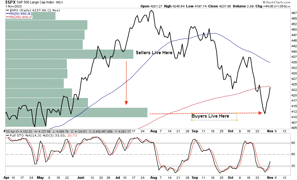
Buyers Live Lower
In “No Cash On The Sidelines,” we discussed the importance of understanding that “market prices” are set by the demand and supply between buyers and sellers. To wit:
“As noted above, the stock market is always a function of buyers and sellers, each negotiating to make a transaction. While there is a buyer for every seller, the question is always at “what price?”
In the current bull market, few people are willing to sell, so buyers must keep bidding up prices to attract a seller to make a transaction. As long as this remains the case and exuberance exceeds logic, buyers will continue to pay higher prices to get into the positions they want to own.
Such is the very definition of the “greater fool” theory.
However, at some point, for whatever reason, this dynamic will change. Buyers will become more scarce as they refuse to pay a higher price. When sellers realize the change, they will rush to sell to a diminishing pool of buyers. Eventually, sellers will begin to “panic sell” as buyers evaporate and prices plunge.”
In other words, “Sellers live higher. Buyers live lower.“
We can see where the buyers and sellers “live” in the following chart, which shows where the highest volume occurred.
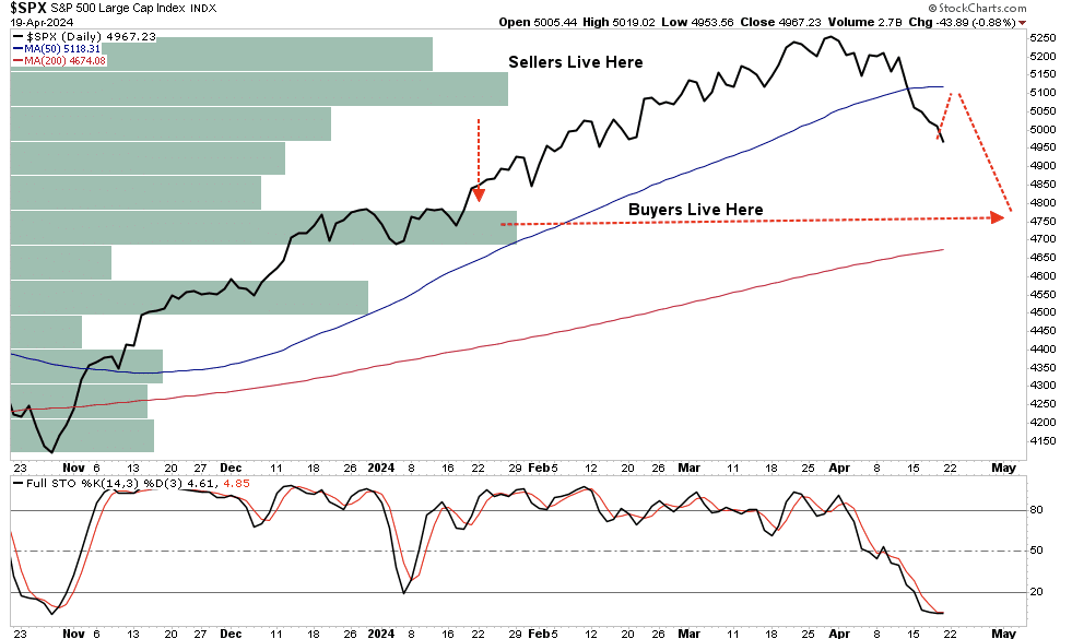
This current correction is becoming increasingly oversold (bottom panel), which suggests a bounce is likely toward the previous support of the 50-DMA. For comparison, we can look at last year’s market correction. As noted, the bullish rally into July peaked late that month. As the market corrected, it bounced from oversold conditions, allowing investors to reduce risk and hedge portfolios. The markets will likely present investors with that opportunity soon.
Then, like today, many investors began to believe it wasn’t just a correction but something much more. However, the reality was that the “buyers lived lower.” Buyers stepped in as prices approached the October lows, coinciding with the return of corporate share buybacks.
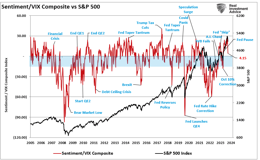
Sentiment Is Reversing Quickly
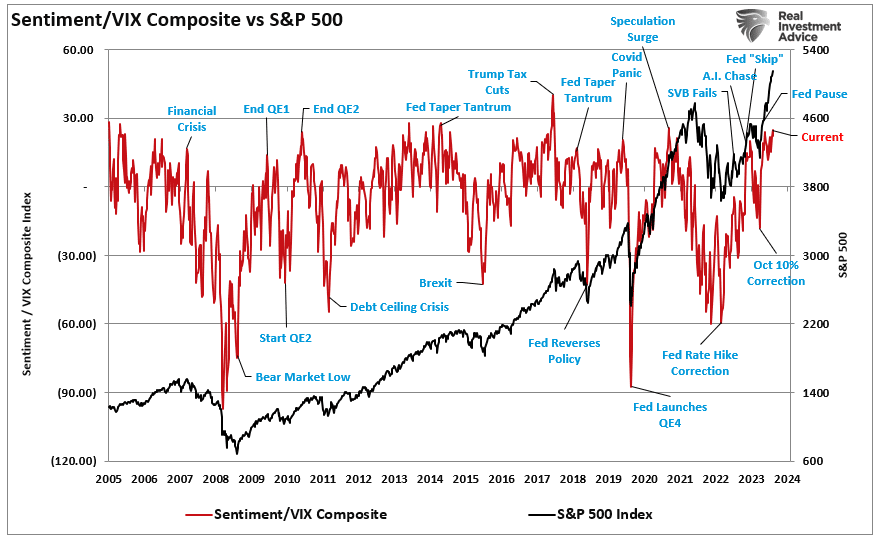
As I said, we need to revisit the sentiment chart above. Investors’ more frothy, bullish sentiment is reversing quickly on many fronts. The chart below, the same as above, is the composite net bullish sentiment index of retail and professional investors divided by the volatility index (VIX). If this is just a market correction, the index tends to bottom between zero (0) and negative (20). With a current reading of 4.15, down from 25.99 just two weeks ago, bullish sentiment has significantly reversed.
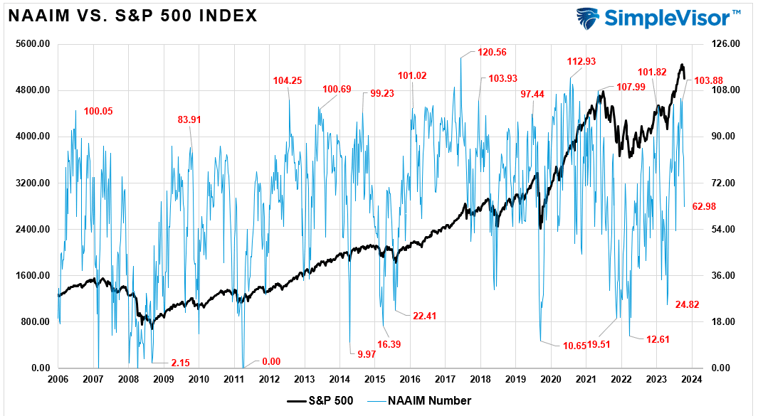
Notably, professional investor allocations to equities recently peaked at 103.88%, which has collapsed in just two weeks to just 62.98% exposure. (Professional investors are notorious for buying market peaks.)
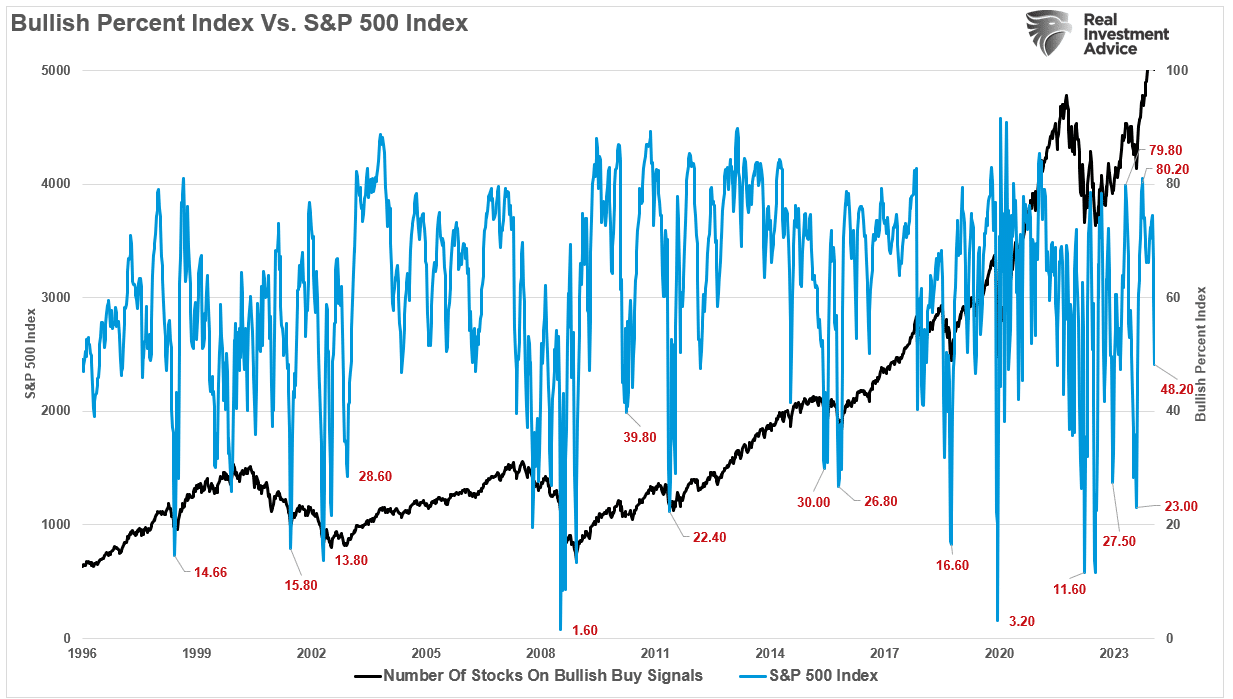
Also, the number of stocks on bullish “buy signals” has dropped from 80.2 to 48.2.
Furthermore, the number of stocks trading above the 50-DMA has fallen from over 80% to 37%, with money flows hitting levels lower than previous market bottom lows. Notably, with just a 5.5% correction from the recent peak (as of last Friday), much of the work of clearing the previous overbought conditions is completed.
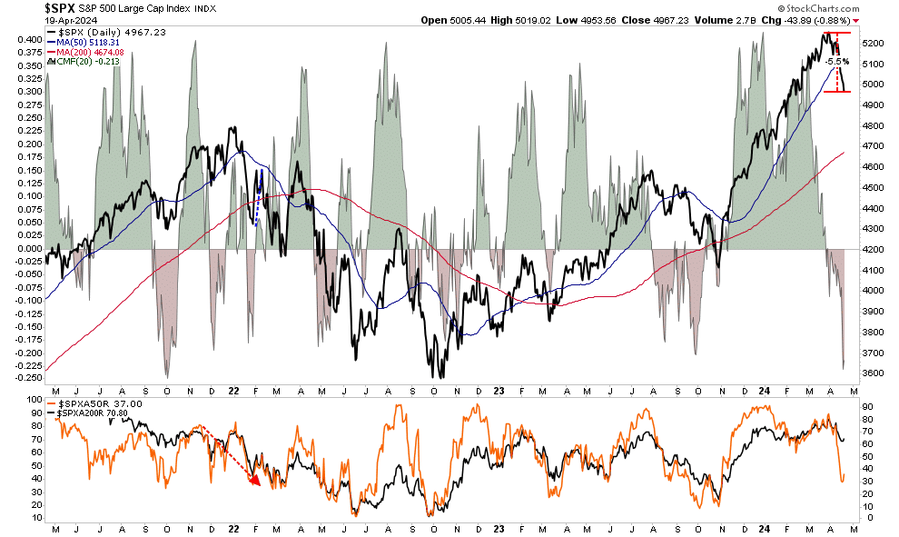
Given the significant reversal in sentiment and short-term oversold conditions, we highly suspect the markets will provide a reflexive rally soon. However, with the number of bullish investors who got “trapped” in the selloff, any rallies will likely be met with further selling.
However, despite the current “panic” in the media headlines, this is likely just a correction within an ongoing bullish market. Such is particularly the case given that corporate share buybacks will resume in May, providing critical support for the markets heading into summer.
With that said, this correction, when complete, likely won’t be the last we see this year. Market history suggests we could see another “bumpy ride” heading into what many expect will be a somewhat contentious election.
But that is an article we will write when we get there.
The post Just A Correction, Or Is The Bull Market Over? appeared first on RIA.
Economic Warning From The NFIB
The latest National Federation of Independent Business (NFIB) survey was an economic warning that departed widely from more robust governmental reports. In a recent analysis of small businesses, we discussed the importance those business owners play in the economy.
“It is crucial to understand that small and mid-sized businesses comprise a substantial percentage of the U.S. economy. Roughly 60% of all companies in the U.S. have less than ten employees.
Small businesses drive the economy, employment, and wages. Therefore, the NFIB’s statements are highly relevant to the economy’s current state compared to the headline economic data from Government sources.”
While recent government data on economic growth and employment remain robust, the NFIB small business confidence survey declined in its latest reading. Not only did it fall to the lowest level in 11 years, but, as far as an economic warning goes, it remained at levels historically associated with a recessionary economy.
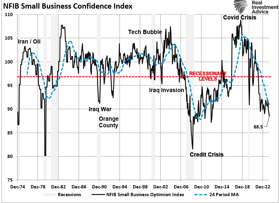
The decline in confidence should be unsurprising given the largest deviation of interest rates from their 5-year average since 1975. Higher borrowing costs impede business growth for small businesses, as they don’t have access to the bond market like major companies.
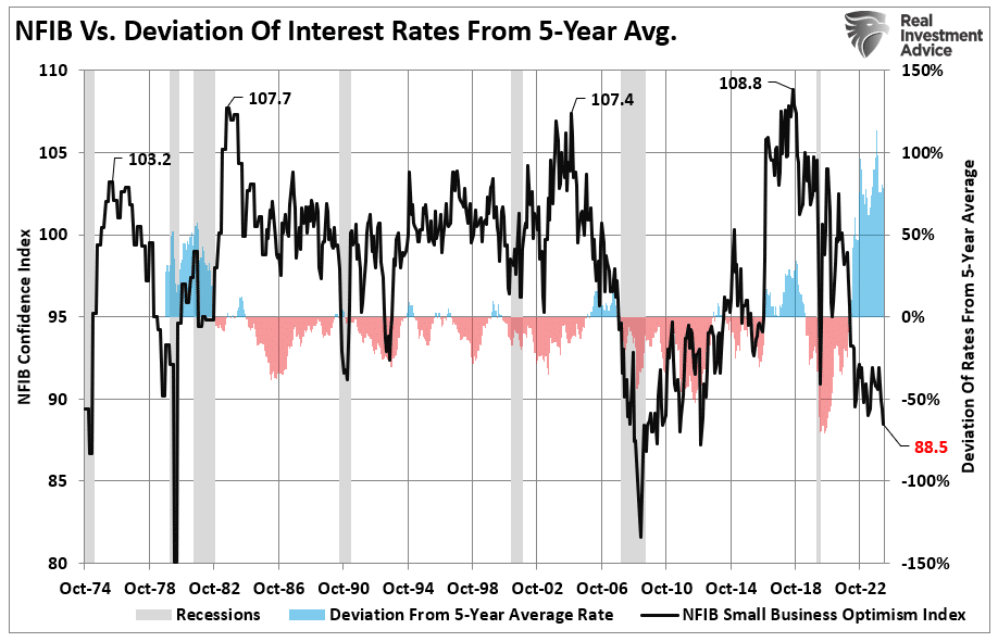
Therefore, as the economy slows and interest rates rise, small business owners turn to their local banks for operating loans. However, higher rates and tighter lending standards make access to capital more difficult.
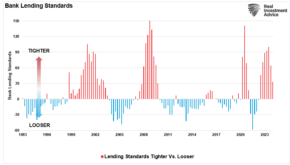
Of course, given that capital is the lifeblood of any business, decisions on hiring, capital expenditures, and expansion hang in the balance.
Economic Warning – Capital Expenditures
It should be unsurprising that if the economy were expanding as quickly as headline data suggests, business owners would be expending capital to increase capacity to meet rising demand. However, in the most recent NFIB report, the percentage of business owners planning capital expenditures over the 3-6 months dropped to the lowest level since the pandemic-driven shutdown.
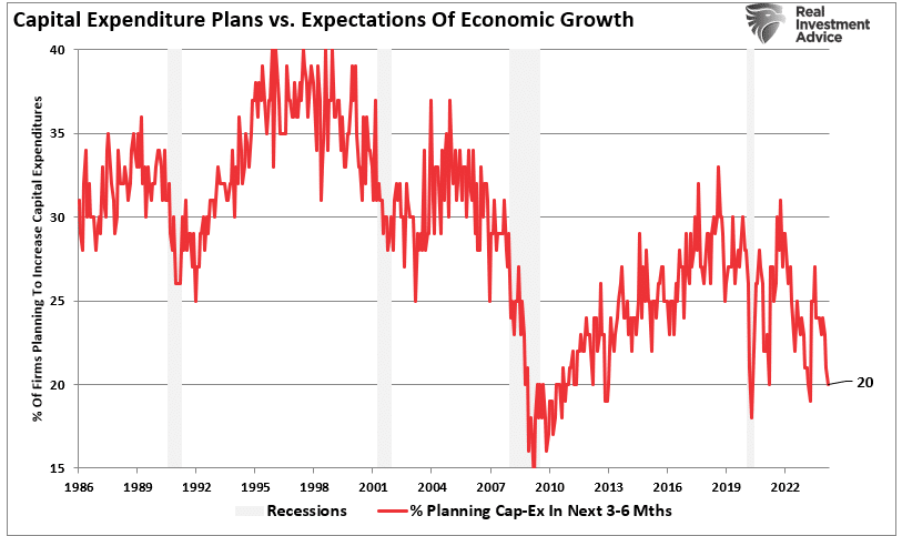
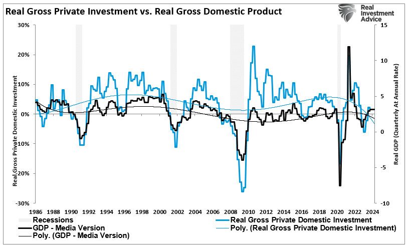
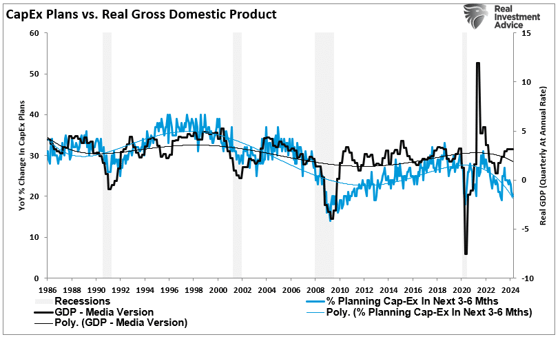
Again, given that small businesses comprise about 50% of the economy, there is more than just a casual relationship between their capital expenditure plans (CapEx) and real gross private investment, which is part of the GDP equation.
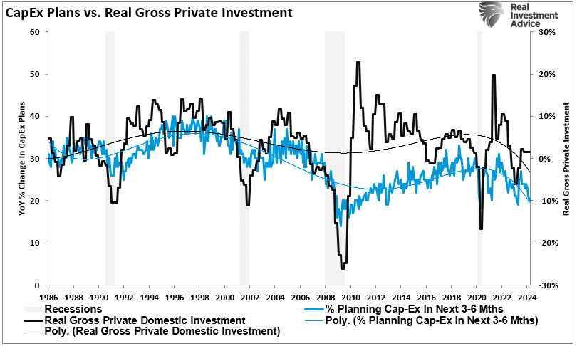
In other words, if small businesses cut back on CapEx, this will eventually translate into slower rates of private investment and, ultimately, economic growth in coming quarters.
As shown, the correlation between small business CapEx plans and economic growth should not be dismissed. While mainstream economists are becoming increasingly optimistic about an “economic reflation,” the economic warning between real GDP and CapEx suggests caution.
Of course, if small businesses are unwilling to increase CapEx, it is because there is a lack of demand to justify those expenditures. Therefore, if CapEx is falling, we should expect economic warnings from employment and sales.
Something Amiss With Sales
Many reasons feed into a small business owner’s decision NOT to invest in their business. As noted above, tighter bank lending standards and increased borrowing costs certainly weigh on that decision. However, if “business is booming,” business owners will find the capital needed to meet increased demand. However, looking deeper into the NFIB data, we find rising concerns about the “demand” side of the equation.
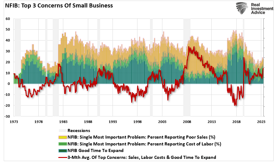
The NFIB publishes several data points from the survey concerning the “concerns” small business owners have. These cover many concerns, from government regulations to taxes, labor costs, sales, and other concerns confronting business owners. When it comes to the “demand” side of the equation, there are three crucial categories:
- Poor sales (demand),
- Cost of labor (the most significant expense to any business), and
- Is it a “Good time to expand?” (Capex)
In the chart below, I have inverted “Good time to expand,” so it correlates with rising concerns about the cost of labor and poor sales. What should be obvious is that the average of these concerns escalates as economic growth weakens (recessionary periods) and falls during economic recoveries. Currently, these rising concerns should provide an economic warning to economists.
Examining sales and employment figures can help us understand why business owners remain pessimistic about the overall economy. The chart below shows the NFIB members’ sales expectations over the next quarter compared to the previous quarter. The black line is the average of both with a long-term median.
Unsurprisingly, business owners are always optimistic that sales will improve in the next quarter. However, actual sales tend to fall short of those expectations. The two have a very high correlation, which is why the average of both provides valuable information. Sales expectations and actual sales are well below levels typically witnessed during recessions. With sales (demand) weak, there is little need to increase production (supply) substantially.
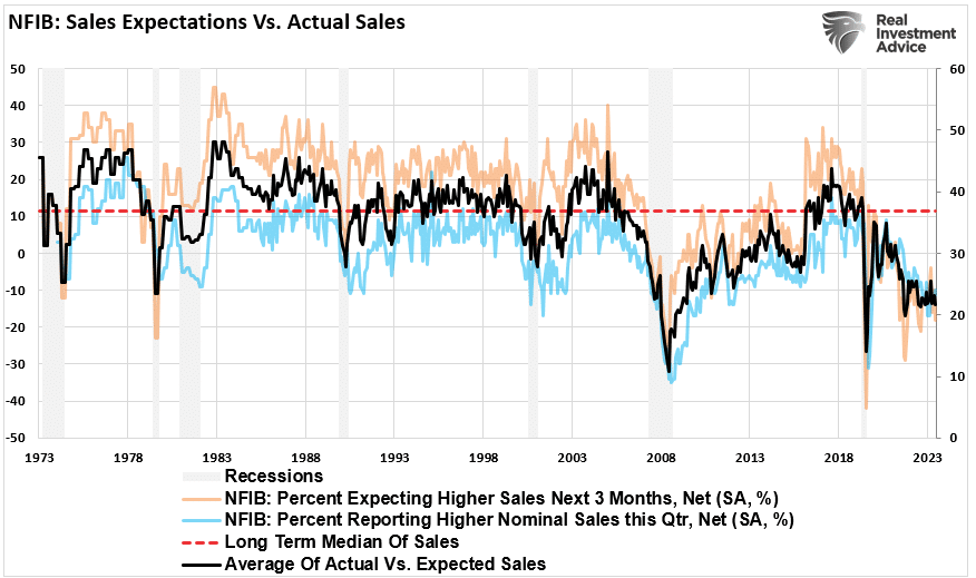
Here is the economic warning to pay attention to. Real retail sales comprise about 40% of personal consumption expenditures (PCE), roughly 70% of the economic growth rate. The decline in the average of actual and expected sales of small businesses suggests weaker retail sales and, by extension, a slower economic growth rate.
Employment Warning
The demand side of the economic equation is crucially important. If the demand for a business owner’s products or services declines, there is little need to increase employment. Therefore, if economic growth was as robust as headlines suggest, why are small businesses’ plans to increase employment declining sharply?
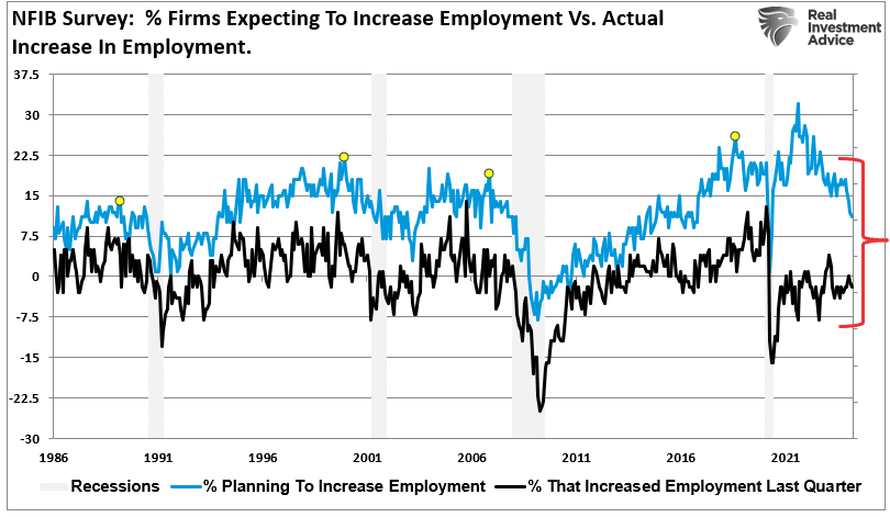
Furthermore, when demand falls, business owners look to cut operating costs to protect profitability. While cutting future employment is part of that equation, so are plans to raise worker compensation.
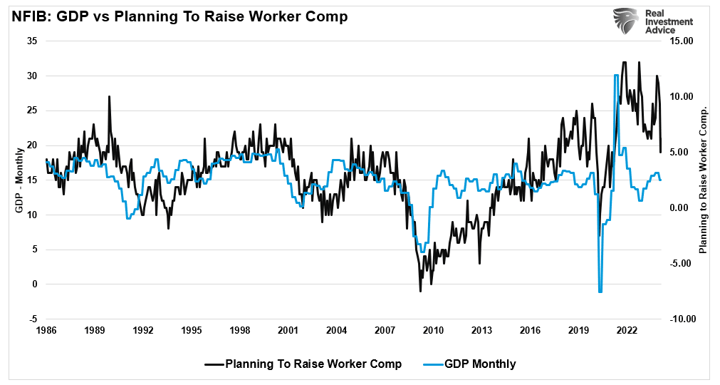
The last chart is crucial. The U.S. is a consumption-based economy. However, consumers can not consume without producing something first. Production must come first to generate the income needed for that consumption. The cycle is displayed below.
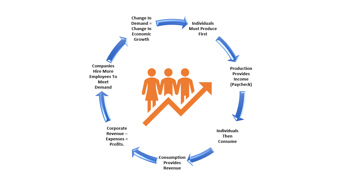
As employees receive fewer compensation increases (raises, bonuses, etc.) amid rising living costs, they cut consumption, which translates into slower economic growth rates. In turn, business owners cut employment and compensation further. It is a virtual spiral that historically ends in recession.
While this time could certainly be different, the economic warnings from the NFIB survey should not be dismissed. The data could explain why the Fed is adamant about cutting rates.
The post Economic Warning From The NFIB appeared first on RIA.
Are We On Japans Path Of Stagnation?
We recently wrote Japan’s Lost Decades to appreciate better why Japan’s GDP is smaller than it was in 1995 and why it took 35 years for its stock market to set its recent record high.
Many pundits claim the U.S. is following Japan’s path. The path includes a stagnant economy, massive government debt, and a central bank that must dominate financial markets to keep the economy and financial markets afloat.
There is merit to that opinion. The U.S. government has excessive debt and is increasingly negligent in managing its budget. Also, the nation’s economic growth rate has been trending lower for thirty years, and fiscal dominance is becoming the norm, not the exception.
While we may be on a similar path as Japan, we are not nearly as far along. There are many differences between Japan and the United States worth considering.
All Asset Bubbles Are Not Alike
At the heart of Japan’s current problems were its massive real estate and stock bubbles that popped in 1989.
To appreciate the enormity of their bubbles, consider the following from Ben Carlson’s article The Biggest Asset Bubble In History.
From 1956 to 1986 land prices in Japan increased by 5000% even though consumer prices only doubled in that time.
By 1990 the Japanese real estate market was valued at 4x the value of real estate in the United States, despite being 25x smaller in terms of landmass and having 200 million fewer people.
Tokyo itself was on equal footing with the U.S. in terms of real estate values.
The grounds on the Imperial Palace were estimated to be worth more than the entire real estate value of California or Canada at the market peak.
There were over 20 golf clubs that cost more than $1 million to join.
In 1989 the P/E ratio on the Nikkei was 60x trailing 12-month earnings.
Japan made up 15% of world stock market capitalization in 1980. By 1989 it represented 42% of the global equity markets.
From 1970-1989, Japanese large cap companies were up more than 22% per year. Small caps were up closer to 30% per year. For 20 years!
Stocks went from 29% of Japan’s GDP in 1980 to 151% by 1989.
Japan was trading at a CAPE ratio of nearly 100x which is more than double what the U.S. was trading at during the height of the dot-com bubble.
The aftershock could have been dealt with in many ways, but at its core, it came down to whether to pay a dear price over a short period or draw out the costs over decades. They elected the latter, saving their banks and relying on massive government spending to insulate the economy.
Over the last 25 years, the U.S. dot com and subprime bubbles have popped. While economically costly, the bubbles were minor compared to Japan’s. Accordingly, when they popped, the economic and financial consequences paled compared to Japan’s.
Banking Sector
The real estate and stock bubbles were supported with massive leverage via bank loans. When the asset values plummeted, the debt supporting them was often worthless. The banking system would have collapsed if the banks had written off the bad loans. The government aimed to keep the banking system out of harm’s way. Essentially, the banks didn’t have to recognize the losses. However, the non-performing loans were still on their books, significantly impeding their lending capabilities.
Further crippling the banks were the BOJ monetary policies which pinned interest rates at zero and below zero for long periods. The result was a flat yield curve. In addition to having a limited ability to lend, BOJ policies severely reduced the financial incentive to lend. Japan’s private sector economy could not contribute to growth nearly as much as possible if the banking sector were healthy and incentivized to lend.
Conversely, U.S. banks are healthy and well-capitalized. Additionally, the Fed is very in tune with the amount of reserves in the banking system and stands ready to provide more when needed. Reserves are the fodder banks require to make loans.
The graph below compares the net interest margin for Japanese and American banks to show how much more financial incentive to lend versus their Japanese competitors.
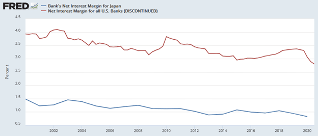
Barring a significant financial crisis, there is no reason to expect U.S. banks to be as restricted as Japanese banks have been.
State-Led Capitalism
As noted in the prior section, Japanese banks have had a minimal ability to lend for much of the last 35 years. As a result of their zombie-like status, the government was heavily obligated to promote economic growth. Accordingly, the government played a much more significant role in managing the economy than is typical in a capitalistic economy.
A key tenant of capitalism states that when the free market sets prices based on the supply and demand for goods and services, it can most efficiently allocate resources to their most productive uses. Commonly, the most productive use of resources benefits economic growth and allows for higher wages and a broad distribution of wealth. Government interference reduces capitalism’s value as capital is often not put to its most productive uses.
Post-World War II Policies
Following World War II, Japan followed a path of capitalism, but it was state-led. Such was probably necessary in the decade or two after the war as the country was physically and emotionally devastated. Japan benefited immensely from the government’s push for rapid industrialization and economic development. But through loose monetary policy, financial deregulation, tax incentives, and infrastructure spending, its policies played a crucial role in inflating the real estate and stock bubbles.
After the bubble, the government was called upon to stimulate the economy. Their interference ultimately resulted in the unproductive allocation of resources, which, in the long term, likely reduced economic activity, thereby prolonging their weakness.
The United States form of capitalism is not as pure as it could be, but it is not nearly as dictated to the same degree as Japan. The Fed and government do reduce the value of capitalism and certainly foster speculation and leverage. But, they have yet to create policies that induce bubbles to the degree Japan saw in the 1980s.
The Yen Versus The World’s Reserve Currency
The U.S. dollar is the world’s reserve currency, and enormous rewards and complications come with it. In our article, Our Currency The World’s Problem we discuss the value of the reserve currency to the U.S.
Foreign nations accumulate and spend dollars through trade. They keep extra dollars on hand to manage their economies and limit financial shocks. These dollars, known as excess reserves, are invested primarily in U.S.-denominated investments ranging from bank deposits to U.S. Treasury securities and a wide range of other financial securities. As the global economy expanded and more trade occurred, additional dollars were required. As a result, foreign dollar reserves grew and were lent back to the U.S. economy.
Making the world even more dependent on the dollar, many foreign countries and companies issue U.S. dollar-denominated debt to better facilitate trade and take advantage of America’s liquid capital markets.
The bottom line is that the U.S. has a constant source of capital to fund our debts, support our asset markets, and buoy the economy. The Japanese Yen provides no such benefits to Japan.
Other Factors
In Japan’s Lost Decades, we discuss Japan’s demographic challenges. To summarize, Japan has an aging population with low birth rates and a meager immigration rate. These factors and others have resulted in a declining population, which weighs on economic growth. While the United States also faces demographic headwinds that are and will negatively impact economic growth, they are not nearly as pronounced as those in Japan.
The United States has a much larger and more diverse economy. This is in part because we are rich in natural resources. The U.S. economy encompasses a wide range of industries, including technology, finance, manufacturing, agriculture, and services. In contrast, Japan’s economy focuses heavily on manufacturing and exports.
Various cultural differences also shape economic policies and affect consumer and corporate behaviors. The business culture in Japan is characterized by lifetime employment contracts and close relationships between corporations and banks (keiretsu). Japan’s population emphasizes consensus and harmony. In contrast, the United States has a more competitive culture centered more on the individual than the nation.
Summary
Fiscal dominance, whereby the Federal Reserve must help the Treasury fund their debts at reasonable costs, is upon us. Japan has relied on fiscal dominance for 35 years. This is one of a few clues that the U.S. is on Japan’s path.
However, as we have written, our nations have significant differences. While we may be on a similar path as Japan, our paths will differ. Since we have not traveled as far on the path as Japan, we have time to learn their lessons and fix them. Will this happen?
The post Are We On Japans Path Of Stagnation? appeared first on RIA.
Reflation Trade Is The New Bullish Narrative
Economic “reflation” is becoming the next bullish narrative as equity valuation increases continue to outpace earnings gains, at least according to Gold Sachs and Tony Pasquariello.
“If GS is correct on the big calls, the macro backdrop is set to remain friendly: the US economy should continue to grow nicely above trend — picking up speed as the year moves along — with three adjustment rates cuts along the way. to not obscure the moral of that story: the Fed is set to ease policy … into an upswing. while Fedspeak this week had a somewhat hawkish bent, the house view for 2024 remains intact.”
Interest rates, gold, and commodity prices have increased in the past few months. Unsurprisingly, the bullish narrative to support that rise has gained traction. Interestingly, this “reflation” narrative tends to resurface by Wall Street whenever there is a need to explain the surge in commodity prices. Notably, the last time Wall Street focused on the reflation trade was in 2009, as noted by the WSJ:
“The most talked-about investing strategy these days isn’t stuffing money in a mattress, it’s the reflation trade — the bet that the world economy will rebound, driving up interest rates and commodities prices.”
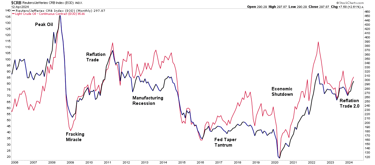
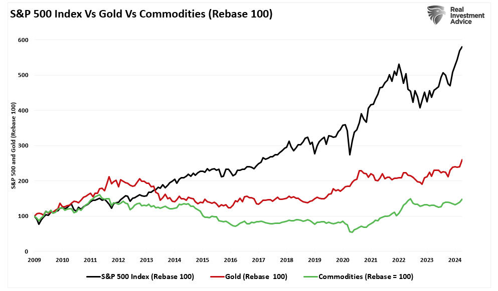
While that “reflation trade” lasted for about two years, it quickly failed as economic growth returned to 2%-ish growth along with inflation and interest rates. As shown, oil and commodity prices have a very high correlation. The critical reason is that higher oil prices reduce economic demand. As consumption falls, so does the demand for commodities in general. Therefore, if commodity prices are to “reflate,” as shown, such will depend on more robust economic activity.
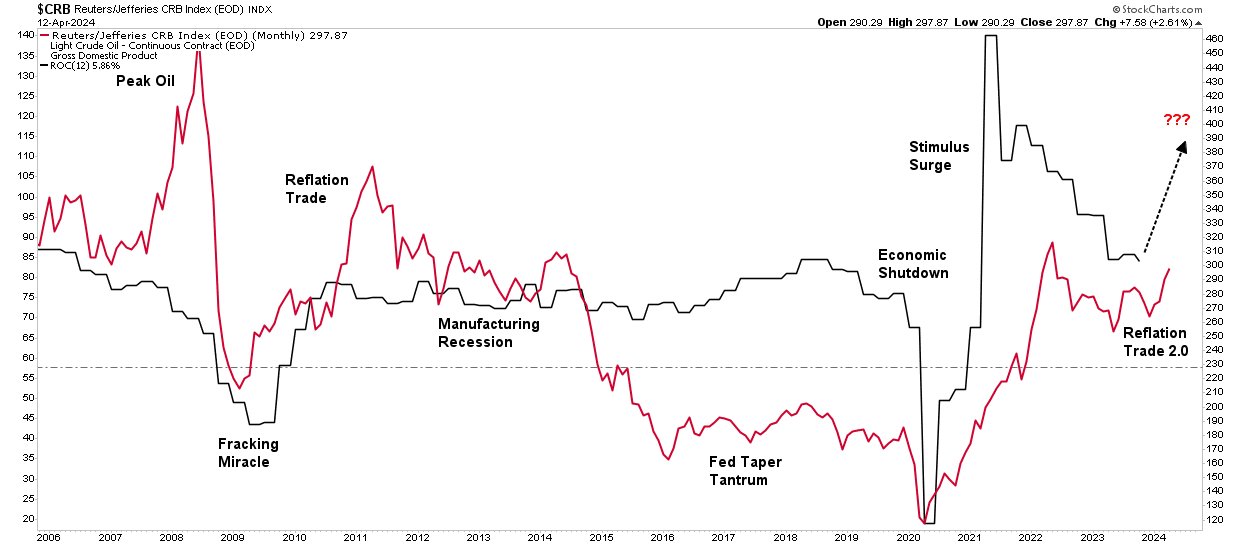
As such. The reflation trade hinges on a global resurgence of economic activity, usually associated with economies recovering from a recessionary period. However, the U.S. never experienced a recession. As discussed in “Deficit Spending,” despite numerous recessionary signals, like the inverted yield curve, manufacturing data, and leading economic indicators, the economy avoided recession due to massive governmental spending. To wit:
“One explanation for this has been the surge in Federal expenditures since the end of 2022 stemming from the Inflation Reduction and CHIPs Acts. The second reason is that GDP was so grossly elevated from the $5 Trillion in previous fiscal policies that the lag effect is taking longer than historical norms to resolve.”
While economists focus on the “reflation trade,” we must answer whether the support for more substantial economic growth exists. This is the sole determining factor in whether the “reflation trade” can continue.
Is Reflation Already Behind Us?
Interest rates and inflation have ticked up recently, driving investors into gold and commodities. However, the surge in precious metals and commodities is more of a function of speculative exuberance rather than an economic resurgence. As discussed in “Speculative Warnings,”
“In other words, the stock market frenzy to “buy anything that is going up” has spread from just a handful of stocks related to artificial intelligence to gold and digital currencies.“
Notably, the gold, commodities, and interest rate surge corresponded with more robust economic growth beginning in the third quarter of last year. That uptick in economic growth defied economists’ expectations of a recession. Such was because of the massive flood of monetary support from Government spending programs. However, that monetary impulse is now reversing.
As far as the “reflation trade” is concerned, as that monetary impulse recedes, so will economic growth, as shown. Even if the economy continues to grow at 2-2.5% annualized each quarter, the annual rate of change in growth will continue to slow.
Importantly, this assumes that the Government will keep “spending like drunken sailors” over that same period. However, if they don’t, the economic growth rate will slow even more quickly without increasing monetary spending.
It is important to remember that increasing debts and deficits do not elicit stronger long-term economic growth. As debt levels rise, economic growth rates will slow as money diverts from productive investment into debt service.
That reality should be unsurprising, as this is not the first time the Government has gone “all in” on a reflation trade. As noted above, following the Financial Crisis, the Government intervened with HAMP, HARP, TARP, and a host of other spending programs to “reflate” the economy.
Let’s review what happened with interest rates, inflation, and gold and commodity trade.
Past May Be Prologue
As noted in 2009, following the “Financial Crisis” and recession, the Government and the Federal Reserve engaged in various monetary and fiscal supports to repair the economy. While the economy initially recovered from the recessionary lows, inflation, economic growth, and interest rates remained subdued despite ongoing interventions.
That is because debt and artificially low interest rates lead to malinvestment, which acts as a wealth transfer mechanism from the middle class to the wealthy. However, that activity erodes economic activity, leading to suppressed inflation and a surging wealth gap.
During that same period, commodities and precious metals rose initially as the “reflation expectation” was widespread. However, debt-driven realities quickly undermined that assessment and those investments languished relative to equities, as the flood of liquidity and low rates made equities far more attractive to investment.
While the relative performance of precious metals and commodities has picked up in recent months, this is more likely a function of “irrational exuberance” in the financial markets. As discussed previously, the surge in speculative investment activity is not uncommon to markets, and currently, many asset classes are becoming highly correlated.
However, while there is a compelling narrative around gold and precious metals from an investment perspective, those chasing that trade have had many years of terrible underperformance. While this time could be different, the “reflation narrative” will most likely fall prey to the realities of excessive debt, which will pressure Governments to cut rates once again.
If the past is potentially prologue, likely, the bullish narrative of “reflation” may once again find future disappointment. Such is particularly the case as the economics of debt and poor policy choices continue to erode the middle class further.
The post Reflation Trade Is The New Bullish Narrative appeared first on RIA.
Immigration And Its Impact On Employment
Is immigration why employment reports from the Bureau of Labor Statistics (BLS) continue defying mainstream economists’ estimates? Many are asking this question as the U.S. experiences a flood of immigrants across the southern border. Concurrently, many young college graduates continue to complain about the inability to receive a job offer. As noted recently by CNBC:
The job market looks solid on paper. According to government data, U.S. employers added 2.7 million people to their payrolls in 2023. Unemployment hit a 54-year low of 3.4% in January 2023 and ticked up just slightly to 3.7% by December.
But active job seekers say the labor market feels more difficult than ever. A 2023 survey from staffing agency Insight Global found that recently unemployed full-time workers had applied to an average of 30 jobs only to receive an average of four callbacks or responses.”
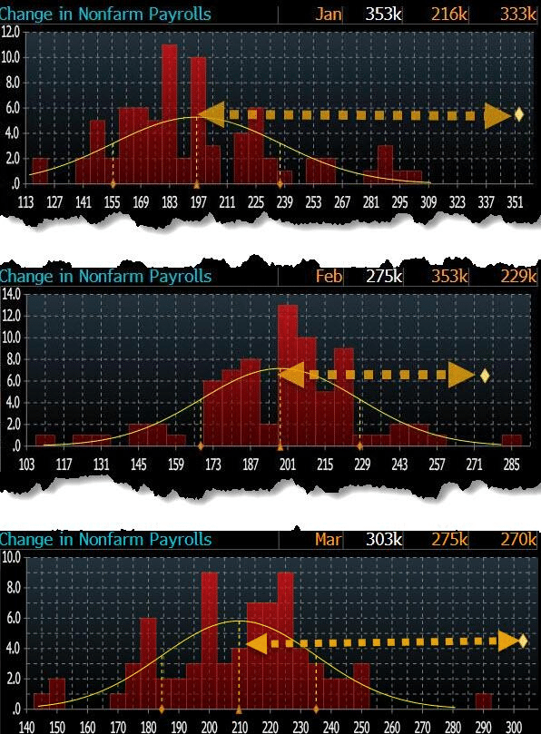
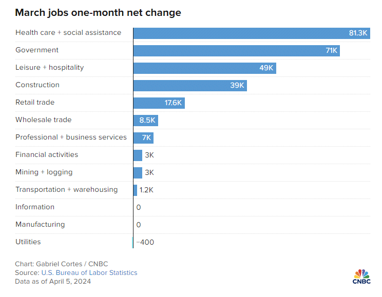
These stories are not unique. If you Google “Can’t find a job,” you will get many article links. Yet employment reports have been exceedingly strong for the past several months. In March, the U.S. economy added 303,000 jobs, exceeding every economist’s estimate by four standard deviations. In terms of statistics, a single four-standard deviation event should be rare. Three months in a row is a near statistical impossibility.
Despite weakness in manufacturing and services, with many companies recently announcing layoffs, we have near-record-low jobless claims and employment. According to official government data, the economy has rarely been more robust.

Such a situation begs an obvious question: How are college graduates struggling to find employment while the labor market remains so strong?
We may find the answer in immigration.
Immigrations Impact By The Numbers
A recent study by Wendy Edelberg and Tara Watson at the Brookings Institution found that illegal immigrants in the country helped boost the labor market, steering the economy from a downturn. Data from the Congressional Budget Office shows a massive uptick of 2.4 million “other immigrants” who don’t fall into the category of lawful immigrants or those on temporary visas. The chart below shows how this figure has spiked from a level of less than 500,000 at the beginning of the 2020s.
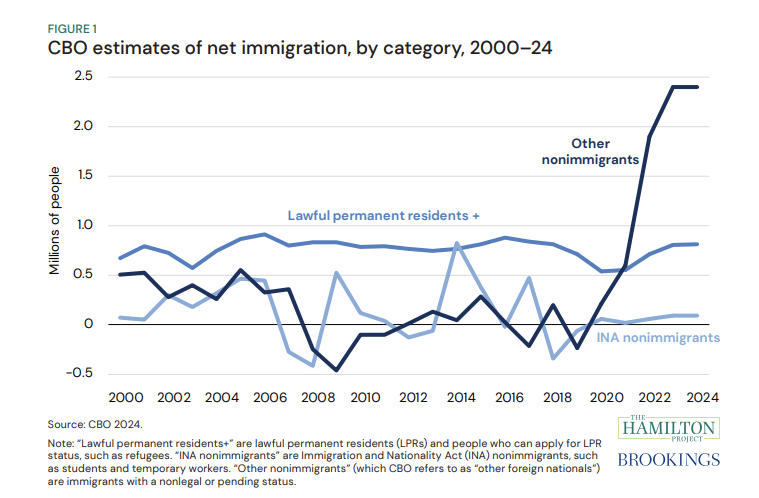
The most significant change relative to the past stems from CBO’s other non-immigrant category, which includes immigrants with a nonlegal or pending status.
“We indicate our estimates of ‘likely stayers’ by diamonds in Figure 2. In FY 2023, almost a million people encountered at the border were given a ‘notice to appear,’ meaning they have permission to petition a court for asylum or other immigration relief. Most of these individuals are waiting in the U.S. for the asylum court queue, which has over a million case backlog. In addition, over 800,000 have been granted humanitarian parole (mostly immigrants from Ukraine, Haiti, Cuba, Nicaragua, and Venezuela). These 1.8 million ‘likely stayers’ in FY 2023 may or may not remain in the U.S. permanently, but most are currently living in the U.S. and participating in the economy. CBO estimates that there were 2 million such entries over the calendar year 2023, which is consistent with higher encounters at the end of the calendar year.”
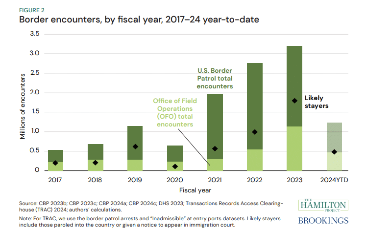
According to the CBO’s estimates for 2023, the categories of lawful permanent resident migration, INA non-immigrant, and other non-immigrant equated to 3.3 million net entries. However, the number is likely much higher than estimates, subject to uncertainty about unencountered border crossings, visa overstays, and “got-aways.”
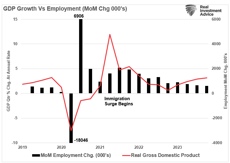
As such, this influx of immigrants has significantly added to payroll growth and has accounted for the uptick in economic growth starting in 2022. While the uptick in border encounters began in earnest in 2021, as the current Administration repealed previous border security actions, there is a “lag effect” of immigration on economic growth.
However, not all jobs are created equal.
Immigration’s Impact On Job Availability
Since 1980, the U.S. economy has shifted from a manufacturing-based economy to a service-oriented one. The reason is that the “cost of labor” in the U.S. to manufacture goods is too high. Domestic workers want high wages, benefits, paid vacations, personal time off, etc. On top of that are the numerous regulations on businesses from OSHA to Sarbanes-Oxley, FDA, EPA, and many others. All those additional costs are a factor in producing goods or services. Therefore, corporations must offshore production to countries with lower labor costs and higher production rates to manufacture goods competitively.
In other words, for U.S. consumers to “afford” the latest flat-screen television, iPhone, or computer, manufacturers must “export” inflation (the cost of labor and production) to import “deflation” (cheaper goods.) There is no better example of this than a previous interview with Greg Hays of Carrier Industries. Following the 2016 election, President Trump pushed for reshoring U.S. manufacturing. Carrier Industries was one of the first to respond. Mr. Hays discussed the reasoning for moving a plant from Mexico to Indiana.
“So what’s good about Mexico? We have a very talented workforce in Mexico. Wages are obviously significantly lower. About 80% lower on average. But absenteeism runs about 1%. Turnover runs about 2%. Very, very dedicated workforce. Which is much higher versus America. And I think that’s just part of these — the jobs, again, are not jobs on an assembly line that [Americans] really find all that attractive over the long term.“
The need to lower costs by finding cheaper and plentiful sources of labor continues. While employment continues to increase, the bulk of the jobs created are in areas with lower wages and skill requirements.
As noted by CNBC:
“The continued rebound of these jobs, along with strong months for sectors like construction, could be a sign that immigration is helping the labor market grow without putting too much upward pressure on wages.”
This is a crucial point. If there is strong employment growth, wages should increase commensurately as the demand for labor increases. However, that isn’t happening, as the cost of labor is suppressed by hiring workers willing to work for less compensation. In other words, the increase in illegal immigrants is lowering the “average” wage for Americans.
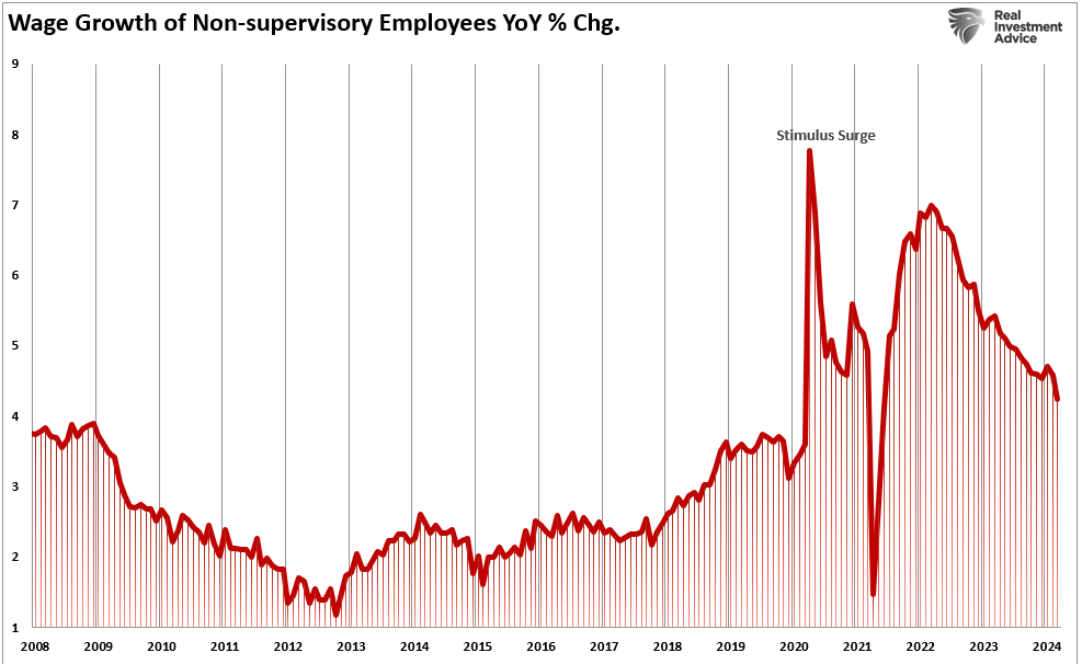
Nonetheless, in the last year, 50% of the labor force growth came from net immigration. The U.S. added 5.2 million jobs last year, which boosted economic growth without sparking inflationary pressures.
While immigration has positively impacted economic growth and disinflation, this story has a dark side.
The Profit Motive
In a previous article, I discussed an interview by Fed Chair Jerome Powell discussing immigration during a 60-Minutes Interview. To wit:
“SCOTT PELLEY: Why was immigration important?
FED CHAIR POWELL: Because, you know, immigrants come in, and they tend to work at a rate that is at or above that for non-immigrants. Immigrants who come to the country tend to be in the workforce at a slightly higher level than native Americans. But that’s primarily because of the age difference. They tend to skew younger.“
You should read that comment again carefully. As noted by Greg Hayes, immigrants tend to work harder and for less compensation than non-immigrants. That suppression of wages and increased productivity, which reduces the amount of required labor, boosts corporate profitability.
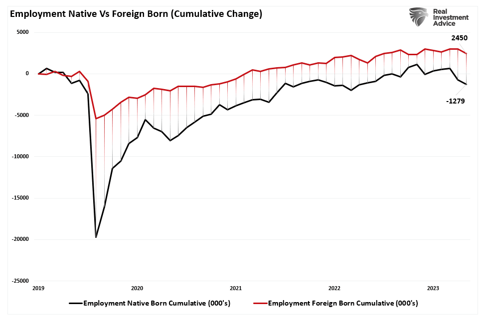
The move to hire cheaper labor should be unsurprising. Following the pandemic-related shutdown, corporations faced multiple threats to profitability from supply constraints, a shift to increased services, and a lack of labor. At the same time, mass immigration (both legal and illegal) provided a workforce willing to fill lower-wage paying jobs and work regardless of the shutdown. Since 2019, the cumulative employment change has favored foreign-born workers, who have gained almost 2.5 million jobs, while native-born workers have lost 1.3 million. Unsurprisingly, foreign-born workers also lost far fewer jobs during the pandemic shutdown.
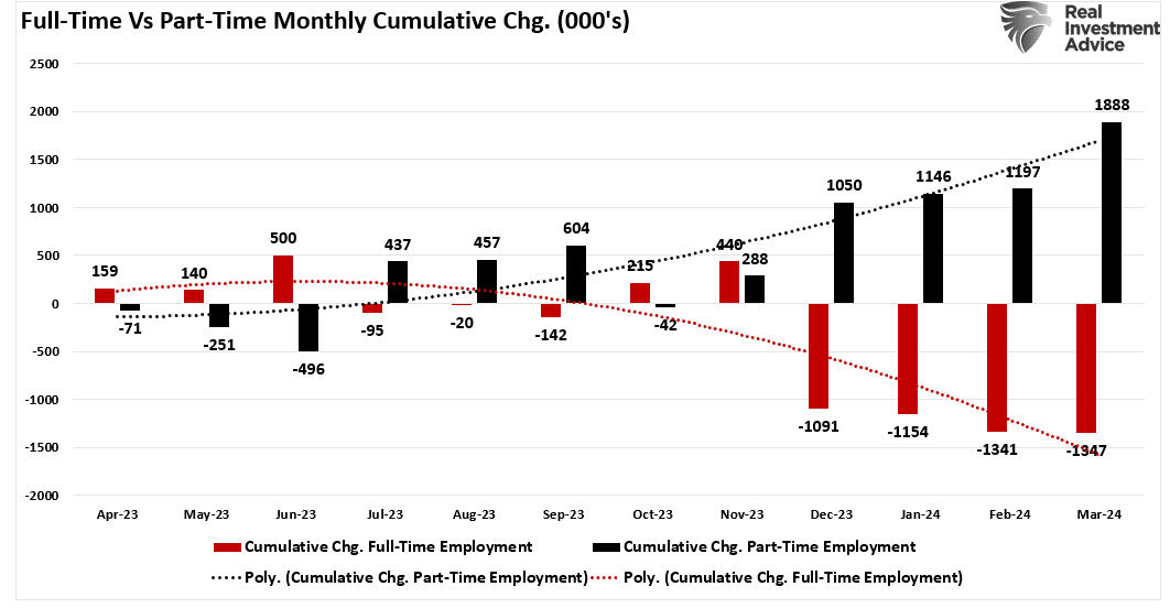
Given that the bulk of employment continues to be in lower-wage paying service jobs (i.e., restaurants, retail, leisure, and hospitality) such is why part-time jobs have dominated full-time in recent reports. Since last year, part-time jobs have risen by 1.8 million while full-time employment has declined by 1.35 million.
Not dismissing the implications of the shift to part-time employment is crucial.
Personal consumption, what you and I spend daily, drives nearly 70% of economic growth in the U.S. Therefore, Americans require full-time employment to consume at an economically sustainable rate. Full-time jobs provide higher wages, benefits, and health insurance to support a family, whereas part-time jobs do not.
Notably, given the surge in immigration into the U.S. over the last few years, the all-important ratio of full-time employees relative to the population has dropped sharply. As noted, given that full-time employment provides the resources for excess consumption, that ratio should increase for the economy to continue growing strongly.
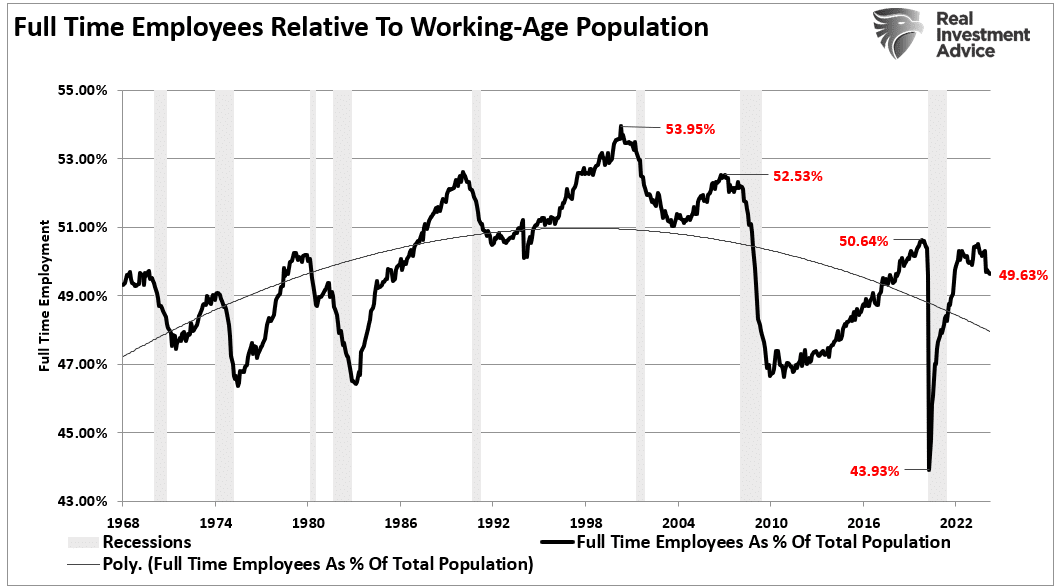
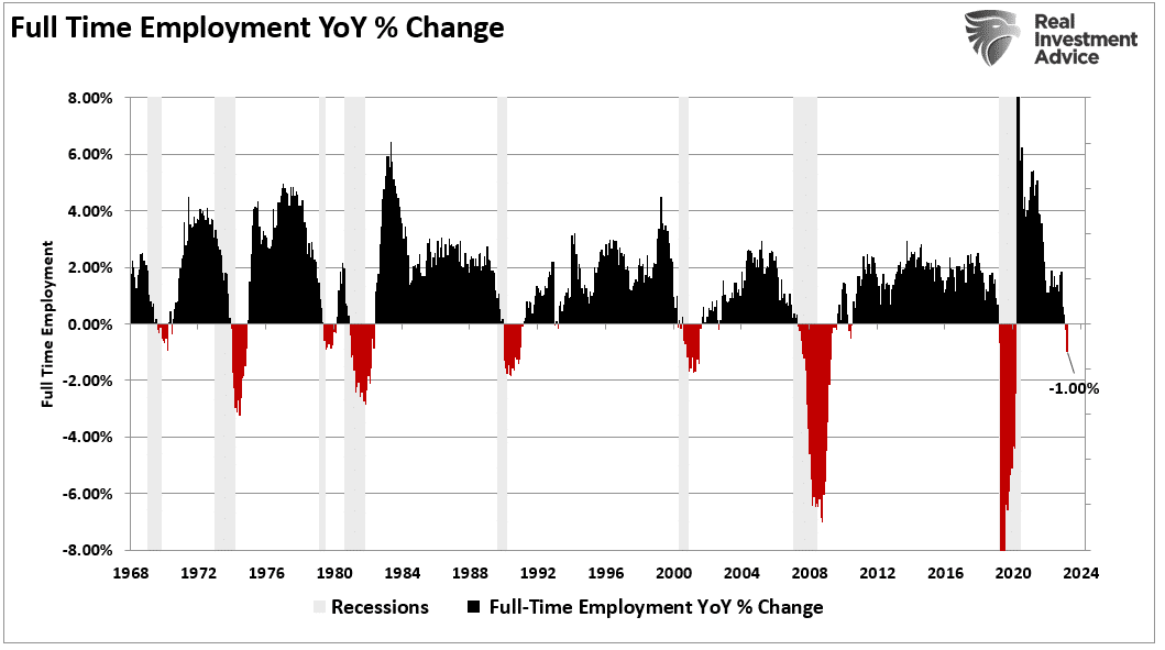
However, the reality is that the full-time employment rate is falling sharply. Historically, when the annual rate of change in full-time employment dropped below zero, the economy entered a recession.
While there is much debate over immigration, most of the arguments do not differentiate between legal and illegal immigration. There are certainly arguments that can be made on both sides. However, what is less debatable is the impact that immigration is having on employment and wages. Of course, as native-born workers continue to demand higher wages, benefits, and other tax-funded support, those costs must be passed on by the companies creating those products and services. At the same time, consumers are demanding lower prices.
That imbalance between input costs and selling price drives companies to aggressively seek options to reduce the highest cost to any business – labor.
Such is why full-time employment has declined since 2000 despite the surge in the Internet economy, robotics, and artificial intelligence. It is also why wage growth fails to grow fast enough to sustain the cost of living for the average American. These technological developments increased employee productivity, reducing the need for additional labor.
Unfortunately, college graduates expecting high-paying jobs will likely continue to find it increasingly frustrating. Such is particularly the case as “Artificial Intelligence” gains traction and displaces “white collar” work, further squeezing the demand for “native-born” workers.
The post Immigration And Its Impact On Employment appeared first on RIA.
Is Gold Warning Us Or Running With The Markets?
Having risen by about 40% since last October, Gold is on a moonshot. Many investment professionals consider gold prices to be a macro barometer, measuring the level of anxiety in the economy, inflation, currency, and geopolitics. Therefore, we must investigate what is and isn’t driving the price of gold higher.
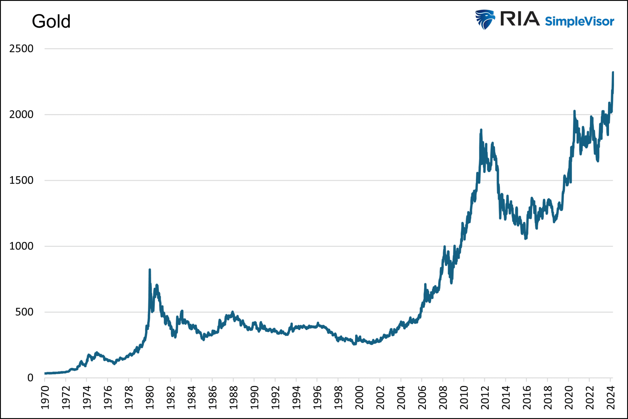
The Divorce Between Gold and Real Yields
To help us figure out what may be driving the momentum in Gold, it is worth first considering that a trusty relationship that largely explained the movement in gold prices broke down about two years ago.
The graph below, courtesy of Matt Weller, shows the 15-year-old correlation between gold prices and real yields is not working. Real yields, or rates, are simply the current yield of a Treasury bond minus the rate of inflation or expected inflation.
It serves as a measure of how loose or restrictive monetary policy is. The higher the real yield, the more restrictive monetary policy is, and vice versa.
The graph below shows the current level of real yields, which is the highest in fifteen years. Accordingly, it’s fair to claim that monetary policy is very restrictive, regardless of how the Fed may have shifted its stance in recent months.
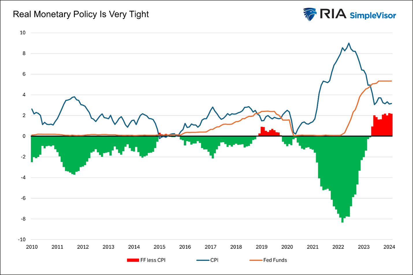
In our article The Feds Golden Footprint we discussed why the relationship between Gold and real yields exists.
The level of real interest rates is a sturdy gauge of the weight of Federal Reserve policy. If the Fed is treading lightly and not distorting markets, real rates should be positive. The more the Fed manipulates markets from their natural rates, the more negative real rates become.
The article shared our analysis, which divided the last 40 years into three periods based on the level of real yields.
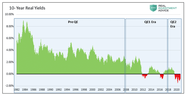
As the Fed’s monetary policy became more aggressive in 2008, the relationship between Gold and real yields grew. Before 2008, there was no statistical relationship.
Per the article:
The first graph, the pre-QE period, covers 1982-2007. During this period, real yields averaged +3.73%. The R-squared of .0093 shows no correlation.
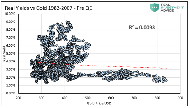
The second graph covers Financial Crisis-related QE, 2008-2017. During this period, real yields averaged +0.77%. The R-squared of .3174 shows a moderate correlation.
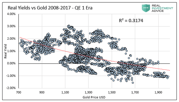
The last graph, the QE2 Era, covers the period after the Fed started reducing its balance sheet and then sharply increasing it in late 2019. During this period, real yields averaged 0.00%, with plenty of instances of negative real yields. The R-squared of .7865 shows a significant correlation.
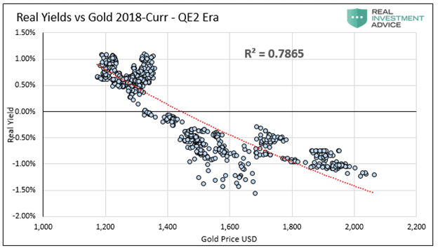
Given our historical analysis and the current instance of high real yields, it is unsurprising that the relationship between the price of Gold and real yields has faded.
Therefore, without real yields steering the price of Gold, let’s consider a few possibilities for why it is rising so rapidly.
Fiscal Imbalance
The Federal government is running large deficits. As shown below, the annual percentage increase in federal debt is over 8%. Such significant deficit spending occurs as economic growth is running above its natural growth rate and pre-pandemic levels. Typically, deficits tend to be lower during periods of economic growth and bigger during recessions or economic slowdowns.
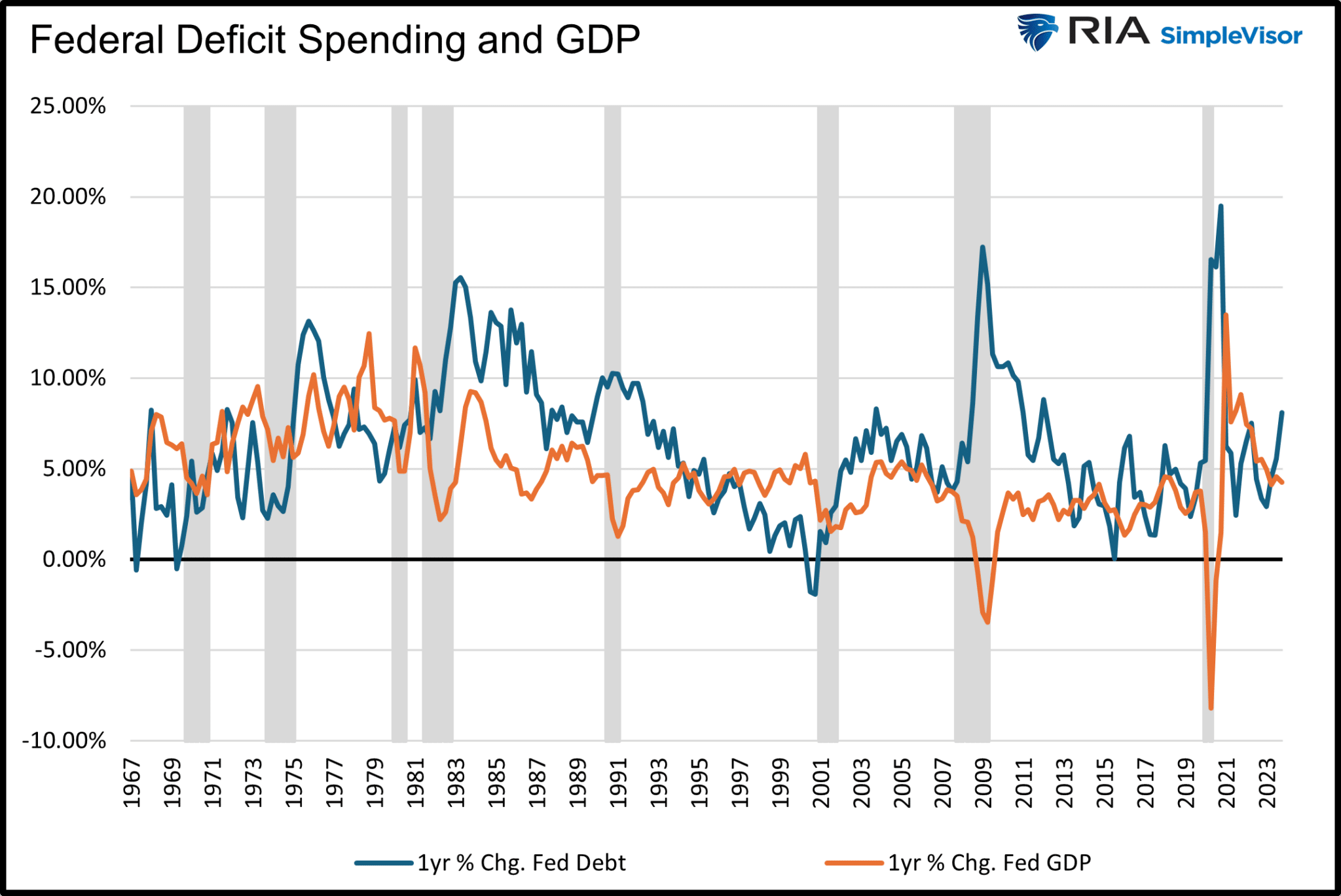
The recent increase in debt growth is significant, but not much more so than other non-recessionary peaks in the last ten years. Additionally, it is well below the debt increases associated with recessions. A $2+ trillion-dollar deficit sounds daunting, but the economy has grown by 33% or $7 trillion since 2020 and doubled in size since 2009. The graph below, showing the debt-to-GDP ratio, helps put more context on the rate at which the government borrows.
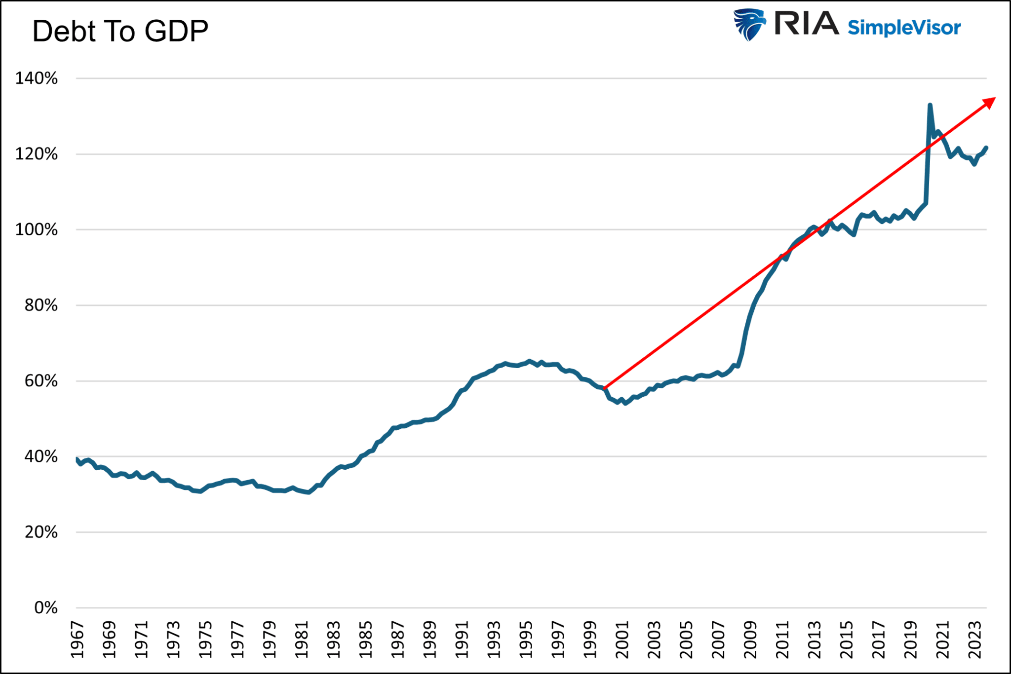
The upward trending debt to GDP ratio is not sustainable. However, the current ratio and slope of the recent trend align with the trend going back 20 years and even longer.
We have written many articles on the problem of debt growing faster than GDP and the economic damage it is doing and will do. However, when putting current deficits into proper context with the pace of economic activity, the recent growth is not glaringly different from other experiences of the last 20 years.
As such, we find it hard to believe that debt is responsible for the recent run-up in Gold.
Geopolitical
Geopolitical problems, especially regarding Ukraine and Israel, are indeed problematic.
Russia could deploy nuclear weapons or expand the war to other neighboring countries. An invasion of a NATO country would all but force involvement from the U.S. and European powers.
The Israeli-Hamas conflict appears to be a proxy war with Iran. While the theater of war is primarily in Gaza and, to a lesser degree, surrounding countries, the possibility of more direct involvement between Israel and Iran is problematic. Direct Iranian actions against Israel would likely be met with military force from the U.S. and other NATO powers.
Not to minimize the two geopolitical events and other less critical ones, but the U.S. and Europe have been in various wars in the Mideast and Afghanistan for most of the last 20 years. Is today’s global geopolitical situation much more frightening than in years past?
As we started writing this on April 4, 2023, a rumor circulated that Iran might be planning missile attacks against Israel. The S&P 500 fell by over 1% rapidly, and Gold promptly gave up $25. If geopolitical concerns are responsible for the recent gains, shouldn’t increasing tensions in the Middle East further add to Gold’s value?
Gold Predicts Inflation, Or Does It?
Some argue that Gold prices are warning that the lower inflation trends of the last 30 years are reversing.
If Gold is such a good predictor of prices, why did the price go nowhere when the Fed and government were raining money on the economy and supply lines were shut down? That period represents the most significant inflationary setup in over 40 years.
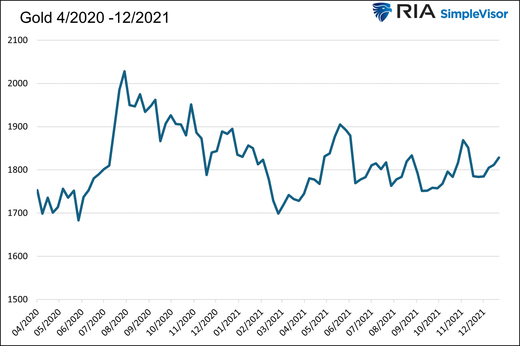
Dovish Fed In High Inflationary Environment
Since late last year, the Fed has flipped from an uber-hawkish tone to a more dovish one. Despite easy financial conditions (LINK), high and sticky inflation, and above-average growth, the Fed seems intent on cutting rates multiple times this year. Many would argue that a more prudent Fed would keep its hawkish tone and possibly raise the specter of increasing rates further.
As we showed earlier, monetary policy, while seemingly becoming easier, is still at its tightest levels in over 15 years. Compare monetary policy today to that in 2013 and 2014. The economy was growing then, yet the Fed had rates pinned near zero percent and was doing QE. As we share below, Gold languished during that period, despite complete monetary policy carelessness.
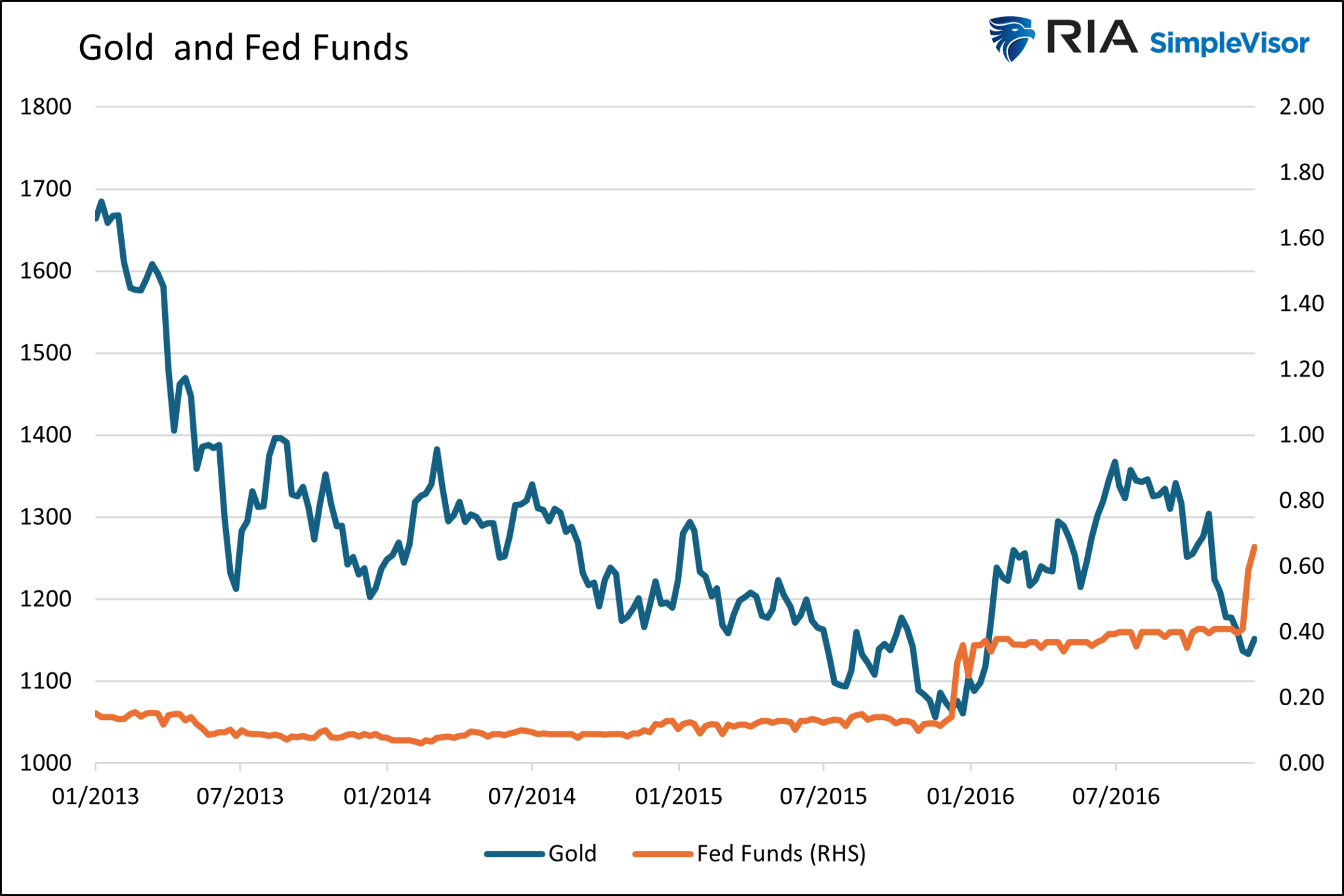
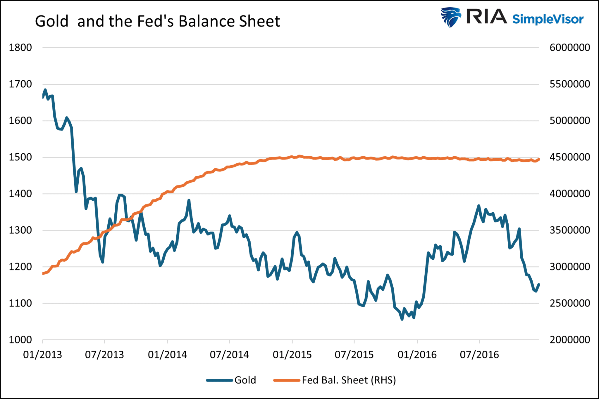
Crypto – AI Mania
Having discussed a few of the standard responses pundits are spewing regarding Gold’s ascent, we share one that may not be as popular with gold holders.
Gold is a speculative asset. Accordingly, it can rise and fall, and at times violently, based solely on the whims of traders and speculators.
Might the current surge in Gold be less a function of the issues we raise above and more about the speculative mania flowing through many markets? Consider the five graphs below. The graphs show a solid visible and statistical correlation over the last two years between Gold and Bitcoin, Nvidia, Meta, Eli Lily, and the S&P 500.
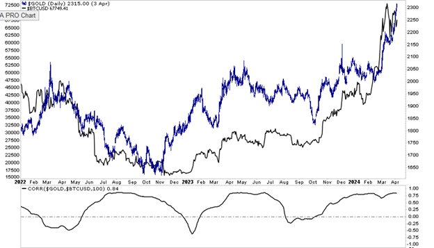
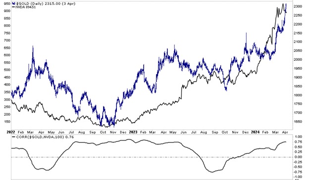
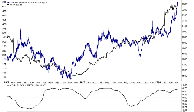
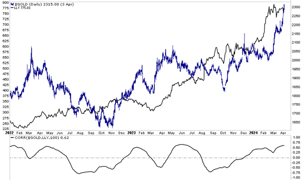
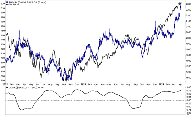
Summary
The previous few sections share some typical rationales to justify higher gold prices. While they sound like legitimate reasons for Gold to soar, when taken into context, they are not that different from other periods in the last twenty years when Gold was flat or trending lower in price.
The price of Gold can provide valuable insights at times. But other times, Gold can give false signals warped by irrational market behaviors. We think Gold is getting caught up in a speculative bubble, and its price is not presenting us with a warning of fiscal, monetary, or geopolitical crisis.
Gold is likely to have a more reliable and sustainable run higher when the Fed returns to its careless ways with real yields near 0% or even negative, and QE is again in operation.
The post Is Gold Warning Us Or Running With The Markets? appeared first on RIA.
Margin Debt Surges As Bulls Leverage Bets
In the most recent report from FINRA, margin debt levels have surged as bullish investors leverage their bets in the equity market. The increase in leverage is not surprising, as it represents increased risk-taking by investors in the stock market.
We previously discussed that valuations, in the short term, reflect investor optimism. In other words, as prices increase, investors rationalize why paying more for current earnings is rational.
“Valuation metrics are just that – a measure of current valuation. More importantly, when valuation metrics are excessive, it is a better measure of ‘investor psychology’ and the manifestation of the ‘greater fool theory.’ As shown, there is a high correlation between our composite consumer confidence index and trailing 1-year S&P 500 valuations.”
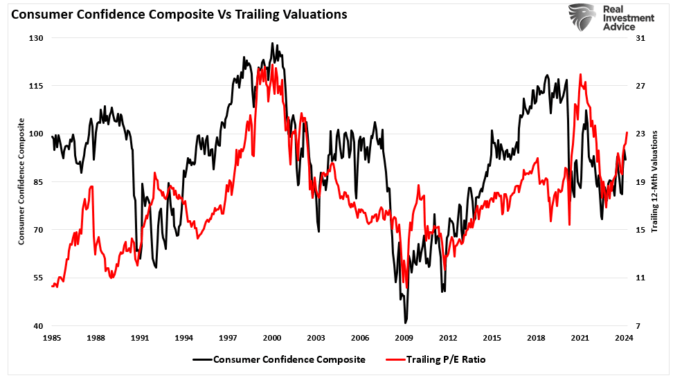
The same holds for margin debt. Unsurprisingly, as consumer confidence improves, so does the speculative demand for equities. As stock markets improve, the “fear of missing out” becomes more prevalent. Such boosts demand for equities, and as prices rise, investors take on more risk by adding leverage.
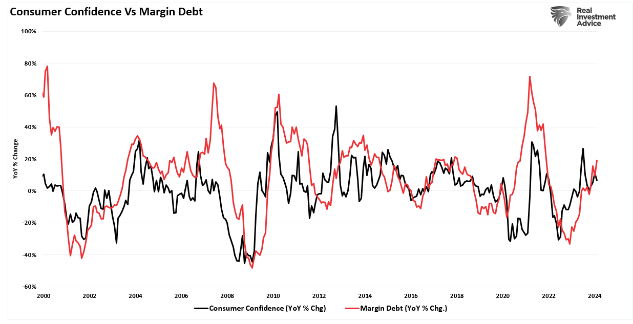
Adding to that exuberance is the increased demand for share repurchases, which has been a primary source of “buying” since 2000. As CEO confidence improves, a byproduct of increased consumer confidence, they increase the demand for share repurchases. As buybacks boost asset prices, investors take on more leverage and increase exposure as a virtual spiral develops.
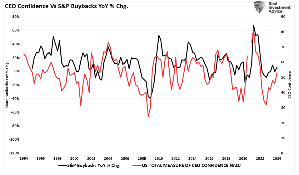
However, should investors be afraid of rising margin debt?
A Byproduct Of Exuberance
Before we dig further into what margin debt tells us, let’s begin with where we are currently. There is clear evidence that investors are once again highly exuberant. The “Fear Greed” index below differs from the CNN measure in that our model measures positioning in the market by how much professional and retail investors are exposed to equity risk. Currently, that exposure is at levels associated with investors being “all in” the equity “pool.”
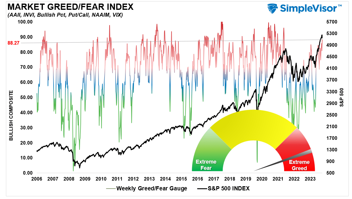
As Howard Marks noted in a December 2020 Bloomberg interview:
“Fear of missing out has taken over from the fear of losing money. If people are risk-tolerant and afraid of being out of the market, they buy aggressively, in which case you can’t find any bargains. That’s where we are now. That’s what the Fed engineered by putting rates at zero…we are back to where we were a year ago—uncertainty, prospective returns that are even lower than they were a year ago, and higher asset prices than a year ago. People are back to having to take on more risk to get return. At Oaktree, we are back to a cautious approach. This is not the kind of environment in which you would be buying with both hands.
The prospective returns are low on everything.”
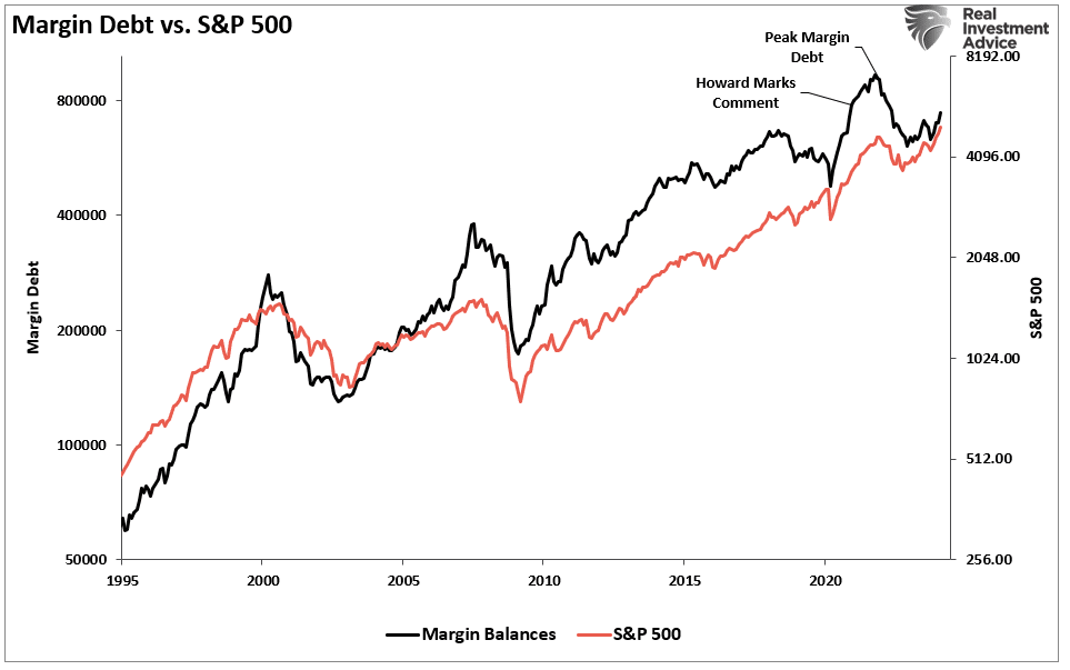
Of course, in 2021, that market continued its low volatility grind higher as investors took on increasing margin debt levels to chase higher equities. However, this is the crucial point about margin debt.
Margin debt is not a technical indicator for trading markets. What it represents is the amount of speculation occurring in the market. In other words, margin debt is the “gasoline,” which drives markets higher as the leverage provides for the additional purchasing power of assets. However, leverage also works in reverse, as it supplies the accelerant for more significant declines as lenders “force” the sale of assets to cover credit lines without regard to the borrower’s position.
The last sentence is the most important. The issue with margin debt is that the unwinding of leverage is NOT at the investor’s discretion. That process is at the discretion of the broker-dealers that extended that leverage in the first place. (In other words, if you don’t sell to cover, the broker-dealer will do it for you.) When lenders fear they may not recoup their credit lines, they force the borrower to put in more cash or sell assets to cover the debt. The problem is that “margin calls” generally happen simultaneously, as falling asset prices impact all lenders simultaneously.
Margin debt is NOT an issue – until it is.
As shown, Howard was eventually right. In 2022, the decline wiped out all of the previous year’s gains and then some.
So, where are we currently?
Margin Debt Confirms The Exuberance
As noted, margin debt supports the advance when markets are rising and investors are taking on additional leverage to increase buying power. Therefore, the recent rise in margin debt is unsurprising as investor exuberance climbs. The chart shows the relationship between cash balances and the market. I have inverted free cash balances, so the relationship between increases in margin debt and the market is better represented. (Free cash balances are the difference between margin balances less cash and credit balances in margin accounts.)
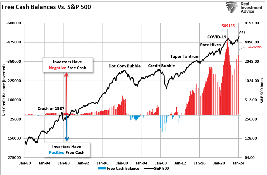
Note that during the 1987 correction, the 2015-2016 “Brexit/Taper Tantrum,” the 2018 “Rate Hike Mistake,” and the “COVID Dip,” the market never broke its uptrend, AND cash balances never turned positive. Both a break of the rising bullish trend and positive free cash balances were the 2000 and 2008 bear market hallmarks. With negative cash balances shy of another all-time high, the next downturn could be another “correction.” However, if, or when, the long-term bullish trend is broken, the unwinding of margin debt will add “fuel to the fire.”
While the immediate response to this analysis will be, “But Lance, margin debt isn’t as high as it was previously,” there are many differences between today and 2021. The lack of stimulus payments, zero interest rates, and $120 billion in monthly “Quantitative Easing” are just a few. However, some glaring similarities exist, including the surge in negative cash balances and extreme deviations from long-term means.
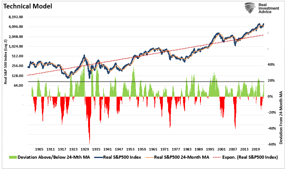
In the short term, exuberance is infectious. The more the market rallies, the more risk investors want to take on. The issue with margin debt is that when an event eventually occurs, it creates a rush to liquidate holdings. Since margin debt is a function of the value of the underlying “collateral,” the forced sale of assets will reduce the value of the collateral. The decline in value then triggers further margin calls, triggering more selling, forcing more margin calls, and so forth.
Margin debt levels, like valuations, are not useful as a market-timing device. However, they are a valuable indicator of market exuberance.
While it may “feel” like the market “just won’t go down,” it is worth remembering Warren Buffett’s sage words.
“The market is a lot like sex, it feels best at the end.”
The post Margin Debt Surges As Bulls Leverage Bets appeared first on RIA.
Telegram Channels
Today's Mass
Traditional Liturgical Calendar

Tags
abortion
anti-Catholicism
anti-Christianity
anti-Russian propaganda
apostasy
Bergoglio anti-Catholicism
Bergoglio effect
Bergoglio heresy
Bergoglio homosexualism
Bergoglio idiocy
Bergoglioism
Bergoglio pontificate failure
Bp. Athanasius Schneider
CallMeJorge
Cardinal Müller
Cardinal Robert Sarah
Cdl. Raymond Burke
China
Church in Germany
Church revival
Covid19 coronavirus totalitarianism
culture of death
diabolical disorientation
DNC
Donald Trump
E.U.
EponymousFlower
euthanasia
feminism
Fr. Allan J. McDonald
Fr. John Hunwicke
Fr. John Zuhlsdorf
Fr. Peter Carota
Fr. Ray Blake
France
Germany
GlobalResearch
Gloria.tv
Gregory DiPippo
Holy Communion for lechers
homosexualism
homosexuality
intra-Church persecution
ISIS
Islam
Islamisation
Laura Wood
leftism
LifeNews
LifeSiteNews
Louie Verrecchio
Maike Hickson
marriage
Matthew Archbold
Michael Matt
modernism
Mundabor
Novus Motus Liturgicus
Novus Ordo
Novus Ordo apostasy
Novus Ordo filth
Novusordoism
Novus Ordo Missae
NovusOrdoWatch
OnePeterFive
papal heresy
papal piracy
papal scandal
persecution
Peter Hitchens
Peter Kwasniewski
political correctness
Pope Benedict XVI
Roberto de Mattei
Ron Paul Institute
Rorate Caeli
Russia
SSPX
Steve Skojec
StrategicCulture.org
Sweden
Syrian war
Tantumblogo
The Remnant
totalitarianism
traditionalism
transgenderism
Tridentine Mass
U.K. decline
U.S. circus
U.S. decline
U.S. militarism
U.S. roguery
Ukraine
Vatican II
Vladimir Putin
VoxCantoris
Western civilisation downfall
Western decadence
Western intervention